Feast India Company: A throng of pink zebras
Photos: Saurabh Suryan / Lokesh Dang
This article appeared in colore #bonbonrosa
Order the print version at: kontakt@brillux.de
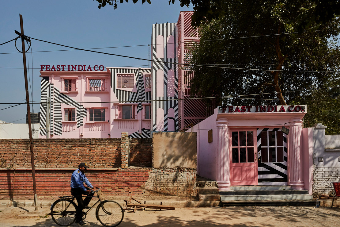
An optical illusion? Is it a surreal dream or actually a zebra dipped in pink paint, startled and bewildered, galloping through the historic rooms and drawing attention with its piercing neighing? Indeed it is! Even from a distance it’s all but impossible to avert the gaze. The Feast India Company building seems to hypnotize, its candy-pink color penetrating the awareness while contrasting black stripes captivate the eye. Responsible for this supremely colorful design is the Indian architectural firm Renesa Architecture Design Interiors Studio, which has repurposed one of the oldest buildings in Kanpur into a restaurant location that doesn't just tickle visitors' sense of taste.

The Feast India Company is a spatial fusion of the past and Art Nouveau.
PROPERTY| LOCATION The Pink Zebra, Feast India Company, Kanpur/Uttar Pradesh
ARCHITECT Renesa Architecture Design Interiors Studio, New Delhi/India
Sanchit Arora is Studio Head Architect at Renesa Architecture Design Interiors Studio. He earned a Bachelor's degree from the Sushant School of Art & Architecture in Gurgaon, India.
Kanpur lies on the west bank of the holy River Ganges in the most populous state of Uttar Pradesh, and until 1947 formed part of the British colonial empire. It was once a significant industrial city, and an engine of progress. There were rows of many different factories, and many people still make a living in leather production. However since its independence, Kanpur has been unable to capitalize on this success. Too many problems thwart development, many companies are shuttered, and hardly any tourists stray into the city. Yet the past, under the rule of the British Raj, has left its mark – architecturally as well. Many colonial buildings remain, even if they have lost some of their charm and have only undergone makeshift renovation.


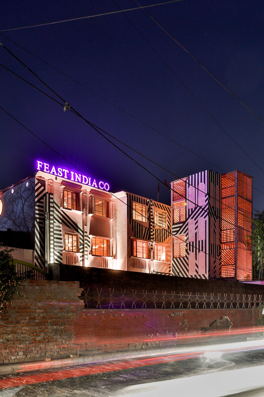

All the more surprising and fascinating is the overhaul done by Renesa Architecture Design Interiors Studio, which has breathed new life into a building inconspicuously set back off the street behind a wall. "The Feast India Company is an homage to the former British culture of Kanpur, as well as a spatial fusion of the past with Art Nouveau polish", says Sanchit Arora, Studio Head Architect of Renesa. Especially the opulent, colonial-style columns and cornices of the building facade are testaments to the beauty of bygone times. And the name itself is a clear reference to the British East India Company, a trading company founded in 1600.
Showing one's colors
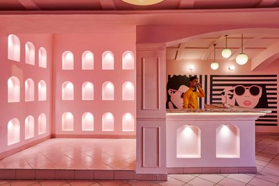
But what gives the building its punchy effect is something completely different – the color! Delicate as a veil, the candy-sweet color envelops the building, flowing into every indentation and resting on every bump – all as if of a piece. "We have decided on this particular coloring because pink is very subtle and fresh, and was even voted as Pantone Color of the Year 2016. Our goal was to create something unique that would significantly rise above the surrounding buildings." For color selection Renesa again harked back to the history of the city: "Pink was commonly used on public buildings in Indian cities at the time of the British Raj." The city of Jaipur in the Indian state of Rajasthan is even called the "Pink City" because in 1876 the buildings in the old town were uniformly painted pink, considered the color of hospitality there.
As far as the eye can see
But the powdery monotony is quickly burst by black and white stripes, seemingly out of nowhere and going off in different directions, back and forth, together and individually, giving the impression of a zebra emerged from a dream and posing in front of a pink backdrop.


The building is affectionately called the "The Pink Zebra" and, although stripes on animals are believed to serve as camouflage and to ward off insects, scientists still do not entirely agree on the purpose of zebra stripes. Black, white, and pink stripes run throughout the entire building, as well as bright stripes of light when the sun shines through grating on ceilings and walls. "When we were preparing the initial draft for the Feast India Company, we toyed with the elements and concepts of colonial style, and tried out a few things. But we quickly noticed something missing – something that had never been seen in a city like Kanpur. It was thus the stripes that brought the building into the here and now, while the spirit of the past can be felt everywhere", says Sanchit Arora.
Inner excitement
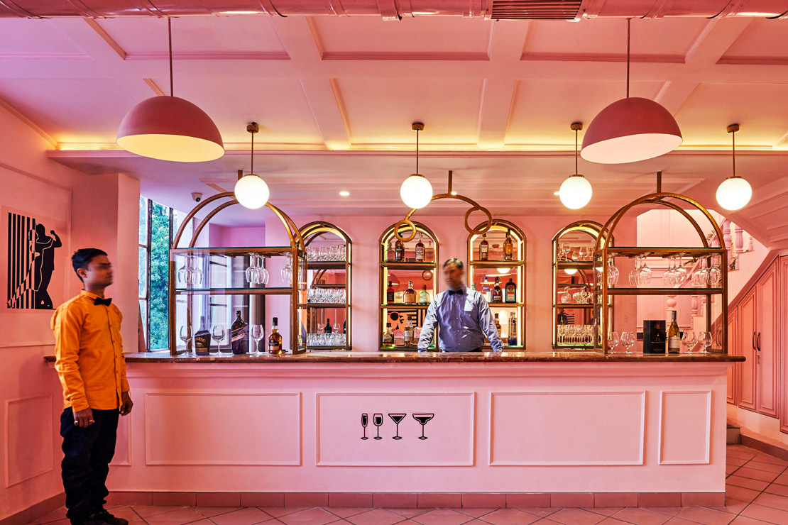
It's not just the outside of the building that enthralls with its hypnotic effect; the stripes also run on the inside, winding around lamps, racing across floors, traversing pictures and doors, and turning into lettering amidst the ubiquitous pink colors. The architects took a very holistic approach: Every piece of furniture was dipped into a bucket of paint, and as relics of bygone times create a historic ambiance in a modern context. Every room boasts the striped look – without exception. Visitors cross lots of zebra stripes just going up or down stairs. The bizarre design influences guests' perception, because "The Pink Zebra is a complex fusion of spatial identities. The idea was to create architecture encapsulating different stylistic movements which would transport visitors to a world influenced by art."
From another world
In the design of the building the architects were also inspired by the films and spatial ideologies of director Wes Anderson. The Pink Zebra is very reminiscent of the Grand Budapest Hotel* from the eponymous film. Anderson’s films are known especially for extreme symmetries, idiosyncratic sets, odd storylines, and pastel colors – not to mention shades of pink. In his films he often creates colorful dream worlds and settings with a high recognition factor thanks to their special aesthetics. With its coloring and contrasting striped elements, The Pink Zebra itself looks like the set of an Anderson film. Guests at the Feast India Company initially find the illusionary design annoying, lurching through rooms while trying to process the visual onslaught. "The goal of our work is to develop an awareness of how we perceive the physical spaces we constantly occupy. This involves both design and aesthetic." Each of the architectural firm’s projects has its own identity, created by using unusual elements and touching people at different levels. The Pink Zebra thus forms a meaningful link between architecture and culinary art: "It whisks guests into another world so they can become part of their own cosmos" – a cosmos in which pink zebras striding through restaurants are part of reality.
*The Grand Budapest Hotel: In 2014 the tragicomedy "The Grand Budapest Hotel" came to German cinemas, enchanting viewers with its colorful scenery, majestic buildings, oddball characters, and incomparable humor. The film bears the unmistakable signature of Wes Anderson, who not only directed but wrote the script. With a love of detail he created a fairy-tale universe in which concierge Gustav H. of the famous Grand Budapest Hotel makes friends with the page Zero in the imaginary land of Zubrowka. Together they have many adventures. The hotel itself shines in wonderful shades of pink, also visible in many other scenes. For the architectural design, Anderson took inspiration from the Hotel Géllert in Budapest. And the confectionery Mendl, which supplies the hotel with pink candy boxes, has its origin in a real institution: the largest confectionery in Vienna, the Aida. Since 1913, pies, cakes, pastries and many more treats have been made here in front of a pink backdrop, from the facade to the uniforms of the wait staff.
The Pink Zebra allows guests to become part of their own cosmos.
Sanchit Arora