Healing architecture: Can colors cure?
Photos:
- Princess Máxima Centre in Utrecht: Ronald Tilleman Photography, copyright by MMEK'/ewout huibers
- St. Hedwig Hospital, Berlin: Werner Huthmacher Photography
- Children's Hospital Charity in Sheffield: Jill Tate
- Outdoor Care Retreat: Ivar Kvaal
This article appeared in colore 20#skyblue
Order the print edition by emailing: kontakt@brillux.de
Clinical tests for medication trials are the norm – but the impact that color can have on recovery has hardly been researched. Despite this, more and more hospitals are embracing color. Evidence-based architecture from Utrecht, Berlin, Lucerne Sheffield, and Oslo demonstrates approaches towards increased acceptance of space, color, and light.
The route to surgery is often traumatic, many would describe it as the very worst. You feel as if you are processed through a system and have to relinquish responsibility. Long corridors only enhance this feeling. The patients in the Princess Máxima Centre in Utrecht are all children diagnosed with cancer.
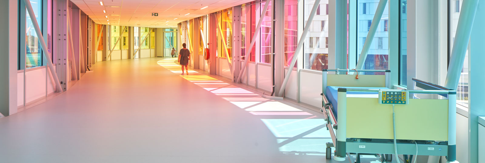
The fact that they now get zoomed to operations or intensive care through a rainbow world instead of a purely functional corridor is all thanks to the firm LIAG Architekten und Baumanagement from The Hague. The 160-meter long corridor between the two hospital buildings is framed by colored glass panes, so the shadows are just as bright as the daylight.
What you can't see in the photo is that the kids aren't simply pushed around in their patient beds, but instead, drive themselves through the rainbow in mini Teslas. Healing architecture therefore means more than simply designing surfaces and spaces – it’s about creating positive experiences.
"A hospital shouldn't just be functional and efficient, but should also focus on the changing needs of the seriously ill," says Tanja Vollmer. The graduate in both biology and psychology has been working as an architectural psychologist since 2009. She therefore had a focus for her vocation, and her studies at the Technical University of Munich set the academic foundations for this.
Her studio, Kopvol Architecture & Psychology (Berlin/Rotterdam), developed the qualitative room concept for the pediatric oncology department in Utrecht – a term from the science of evidence-based design. The qualitative room concept defines the basis for design; in Utrecht, the basic idea was that it should be architecture that supports the healing process. The room aids recovery.
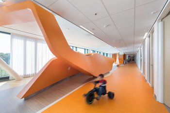
In the pediatric oncology department in Utrecht, the connecting shared areas are designed to be spacious, provide distraction and encourage movement, so as to tempt the kids out of their rooms as soon as possible. The concept of a parent-child unit is a world first.
The patient rooms are zoned in one area, that is designed for children and their friends. Medical staff have no access here. This is a safe space to retreat, aimed to reduce anxiety. It is connected to a treatment zone and something similar to a small hotel room for the parents with a separate entrance door, as well as a connecting door to the child's room, adds the architectural psychologist.
"When developing the parent-child unit, it was important to us that the kids themselves determine how close or far they want to be to their parents." According to preferences, it is possible to slide the big bed next to the child's one. Especially for adolescents, being able to create some flexible space away from parents encourages independence. "After all, many of them spend a long time in the clinic," says Vollmer.
Children have their own colors
At LIAG, the interior and color design was in Thomas Bögl's hands. The architect is one of the total of three office partners. LIAG was not previously known as specialists in the healthcare construction industry, quite the contrary. Utrecht is the first healthcare project for the Dutch studio. LIAG was able to demonstrate enormous expertise in building schools and kindergartens, and are very familiar with how children experience spaces.
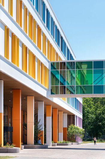
"We wanted all the patients to have constant contact with nature," explains Bögl. For this reason, nature has been brought inside the building as much as possible, the result being the interior courtyards. The architects pictured the facade as a white doctor's coat, using lamellas to provide structure with different color codes.
They are arranged just like in a game of Tetris, which at the same time, resembles the images of DNA code. Depending on the perspective, sometimes you see more color, sometimes less. The entire spectrum of the rainbow is on display. 27 different colors; 15 of which are also included in the connecting bridge to the adjacent hospital. "This is meant to provide space for experience for the children."
The interior is relatively neutral. The architect is aware that "the children have their own colors". They even bring some from home. "Teddies, toys, their own bed linen, and they are also sent cards and photos that they hang up." Everything that the child might get hold of should be made of wood and create a warm atmosphere.
The corridors serve as a racetrack and always end with views of the surrounding landscape; the outlook onto the playground encourages a quick return to health. The pediatric oncology department opened in summer 2018, the first phase of evaluation is still ongoing. This special project was financed because it could then be used as "scientific proof of how the additional spaces impact the wellbeing of parents and children," explains Tanja Vollmer, who is currently implementing a follow-up project for the The Medical Center at the University of Freiburg. The highlight here is the architectural concept of the "anti-waiting room".
The studies undertaken to date on color design within architecture in healthcare are, in her opinion, too weak. They cannot be used in a general enough manner. As an example, the architectural psychologist names a study that shows "that patients are particularly relaxed in front of a green wall, and this reduces aggression in psychiatric patients – so for the last 15 years, many psychiatric facilities have been painted green!"
In parallel with this, there have been many other studies proving that patients lose their confidence in the medical practitioner when treated in front of a green wall. "We trust a doctor more, if they are sitting in front of a white wall," says Tanja Vollmer, but emphasizes that color design is not as simple as that.
How to make a green chicken
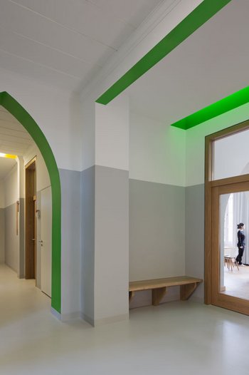
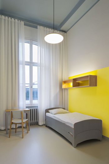
We talk to an architect who considers color as an integral part of all projects, right from the start – in healthcare, too. "Colors should inform and not just be decorative," Jason Danziger opines. The renovation and redevelopment measures he used in Soteria – a therapeutic unit for those with schizophrenia – in St. Hedwig Hospital in Berlin take a courageous as well as a careful approach to color – based on the idea of using high saturation on just a few areas of color.
Here, Danziger's studio, thinkbuild architecture BDA, essentially worked with indirect colors. "Light photons meet on a colored surface and take this color with them," Jason Danziger explains the phenomenon of how to make a green chicken. "We perceive this as the reflected color. That's the trick." As an example, he points to a negative ceiling wreath, painted in highly saturated yellow. "The wall is painted white underneath, but we see a yellow shadow," clarifies the architect. "Those with sensory disorders interpret it in just the same way. It is a democratic phenomenon."
The Berlin resident uses a color system as a tool, based on perception – the basic layout prescribes the rhythm, a kind of schedule, with the color shades used. The intense active colors are absorbed by a neutral base gray. Where in the past, blue floor covering might have guided the patients through yellow corridors to carelessly designed rooms, a coherent overall concept has been in place since 2014. This was made possible by closely collaborating with doctors, and running workshops with the nursing staff. "Color is always a way to help."
"We know that color is good for us and is important," confirms Ute Ziegler, but limits this by adding: "But you can't specify how color must be. We still lack hard facts from science." Ziegler speaks of so-called anecdotal evidence, which essentially means, "that might be the case, but not necessarily."
In the interior design research group a the University of Lucerne, her studies focused on Healthcare Design in application-oriented research, and specifically on the effect of ceilings on bedridden and intensive care patients. "If the brain does not receive sensory stimuli, and always sees the same ting, it begins to hallucinate," explains Ute Ziegler.
In addition to colors, she also takes textures into account in the scenarios yet to be tested. In around two years, the findings from the research project will be applied in an initial design, then testing will continue. Ute Ziegler believes that patients and doctors are the experts on the spaces where they spend time – not the architect.
Conventional color psychology still follows a simple pattern. "Red encourages action and blue is reassuring", summarizes Ziegler, deliberately exaggerating in order to show that it is in fact more complex than this. "I personally have difficulties with this and I would, although I am very much interested in color, never undertake the color design for a hospital."
Not too babyish
The hands of an artist in Sheffield show us what just such a color concept might actually look like. Here, the scenario is once again a pediatric clinic – clearly, younger patients tend to show their true appreciation of color. There is also a case level for children, as London-based architect Mary Reid reports. The Senior Interior Designer at Avanti Architects supported and shaped the extension to the Children's Hospital Charity in Sheffield since 2010.
Here, in addition to scientific studies, specific surveys of employees, patients, and parents also served as a basis. According to the results from the research, Space to Care, children under seven years hardly recall their hospital experiences, whereas many children over the age of seven years tend to find rooms in children's hospitals too childish. Literally, "much too babyish".
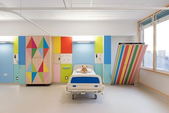
All the more suited to the artistic approach of Morag Myerscough. "My approach was that the rooms should feel like home. A place where young patients and their families can feel good and can experience some positivity in difficult times," comments the artist of her concept, applied in the 46 individual rooms.
The graphic color pattern on the Formica panels of the wall coverings and cabinets are therefore one of the more subtle and sensitive versions of her other designs, so that children with autism and adults are not overwhelmed in the long term. The background surfaces by Avanti Architects vary between light oak, off-white and linoleum in warm gray, calming the brightly printed interior.
View through a window
Ute Ziegler cites the proven healing power of a far-reaching view as mentioned in "View Through a Window May Influence Recovery from Surgery" by American professor of architecture, Roger S. Ulrich, as the "primary study of healing architecture". Norway and Scandinavia are currently making a huge step forward in this direction. Get our of your room, get out of the hospital, is the latest theory, which has been followed since January 2019 at the University Hospital in Oslo and the Sørlandet Hospital Kristiansand.
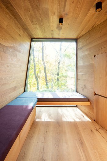
The Snøhetta Studio wanted to achieve "something magical", create a special place. The result is an Outdoor Care Retreat, 100 meters away from the Oslo University Hospital in a small forest. Project architect Nicolai Ramm Østgård tells the story of how it came about. The idea was based on a personal initiative. "A father, whose nine-year-old daughter was ill with cancer, spent time discussing how to escape the frightening environment of the hospital complex with friendly child psychologist Maren Østvold Lindheim", recalls Østgård. The temporary refuge for long-term patients was first of all set to be a small, simple yurt, set into the nature around the clinic. Then Snøhetta got involved.
"The shape is derived from the natural forest environment," explains the young architect. "We wanted to create a kind of tree house, so we thought about wooden structures: A cozy, protective, but also imprecise architecture." While the facade made by Kebony creates a rougher impression, all the interior surfaces are made from high-quality oak and create a warm atmosphere.
You can sit or lie down on one of the built-in benches, the windows frame the view of the forest. The only color in the wooden architecture is added by the cushions, in deliberately bright shades of orange, blue, and violet that can't be found in the forest. "Anything but green", says Nicolai Ramm Østgård. The cabins, each 35 square meters, can be booked individually for a few hours at a time.
The impact of the retreats on the patients is to be examined in a long-term study – feedback so far has been extremely positive. Follow-up projects are already underway at Snøhetta; one in Trondheim, another in Østfold; two further retreats are set to be completed in fall 2019 in Oslo and Kristiansand. The results of the evaluation will probably make financing easier for further spaces for reflection and retreat.
"Wood is still a difficult choice in healthcare settings," states Ute Ziegler. Alongside the nature of the material and the color, she believes it plays a key role in making clinics appear warmer and more homey. Steel, ceramics, and other smooth materials have a negative effect on acoustics and therefore also the atmosphere. "But there are now many hospital facilities who are choosing floors made of wood or wooden details, such as handrails," adds the architect.
And if having plants inside also represents a problem – earth and plants carry germs – Ute Ziegler emphasizes the potential for further research in the field of healing architecture. On their Mars missions, NASA is currently testing how plants can be taken into space with alternative, germ-free substrates. A jungle in a hospital would surely not just prove popular with the patients. Then the path to recovery might not seem as tough as a trip to Mars.
Effects of the environmental factors of color and light
The fact that color and light have an impact on the well-being and happiness of people has been proven by a study carried out in 2017, as part of the refurbishment measures on three wards in the Clinic for Intensive Care Medicine in the University Hospital of Wuppertal. The background to this was scientific discussion in the field of intensive care medicine relating to the negative effects of prolonged psychosis ("brief reactive psychosis") on the morbidity and mortality of patients, with the aim of finding alternatives to treatment with medication. A sample room was equipped with biodynamic lights to counter-effect the psychosis. In a participatory process with workshops, new color concepts were established for all rooms on the ward in line with the selected variant. The measures included, in addition to designing the sample room, changing the floor covering (for safety), the room colors (for privacy and well-being), and the door color (orientation). This has actually resulted in drastically reduced consumption of medication. Patients reported an increase in the feeling of privacy by 55.2 percent; the assessment of the environmental design rose from by an average of 32.3 percent, and the staff even higher, by 40.8 percent. The use of medication was reduced by 30.1 percent.
HELIOS University Hospital in Wuppertal – Clinic for Intensive Care Medicine
In cooperation with Axel Buether from the Faculty of Art and Design at the University of Wuppertal
Duration: 12 months
Space, color, and health
The VR-reality-based research study "Space – Color – Health" of the Pediatric Oncology Department at the University Hospital of Schleswig-Holstein Lübeck in cooperation with the TH Lübeck and Brillux GmbH & Co. KG put special focus on color harmonies, color relationships, and color perceptions. Based on extensive analysis of past studies in the field of color design in healthcare, first of all, it was possible to focus on ten color shades (yellow, orange, red, violet, blue, green, white, gray, black, and brown). A research team led by Professor Wehring and Ms. Ebener then developed three design options in the subsequent step. Three theories are being tested:
- Blue and less saturated green shades are good for intensive care units.
- Hospitals should look less like institutions, and instead more like homes.
- Patterns should always be accompanied by a neutral wall, so as to create a balance.
All three options were tested during the 2018/19 winter semester, in a virtual space, with a total of 105 subjects, divided into three areas; response, room impact, and associations. In addition to the study parameters, color variants, the space parameters such as surface area, height, natural and artificial lighting, furnishings and materials were also examined. The method developed in collaboration with the Brillux Color Studio, based on VR technology, is currently being used as an advisory tool in the healthcare construction industry.
University Hospital of Schleswig-Holstein Lübeck
In cooperation with TH Lübeck and Brillux GmbH & Co. KG
Duration: 6 months
'Parametrische (T)Raumgestaltung'
For the last seven years, the 'Parametrische (T)Raumgestaltung' team at the Campus Virchow-Klinikum of the Charité have been researching the effects of the atmosphere of a space on the healing process of intensive care patients. As part of this, in two pilot intensive care rooms developed specially for this, the technical equipment is put in the background, while the visual environment can be adapted individually to the condition of the patient. The interior design concept was drafted by GRAFT Architekten in close collaboration with doctors and nursing staff: Both rooms, each containing two beds, were next to each other. A small observation room with separate access is placed between them. The rooms were primarily developed from the patient’s perspective, and are coordinated with the perception of the person lying in bed. Lighting and acoustics played a significant part. An individually controllable light concept, developed in cooperation with the media designers from ART + COM, supports the natural sleep/waking rhythm and provides orientation. Disruptive noises from devices and alarm signals can be muted or only played back in the observation room.
Charité Campus Virchow-Klinikum
In cooperation with GRAFT, ART+COM and the Charité CFM Facility Management GmbH
Duration: Ongoing since 2013
