Fabulous color spaces: Description of color concepts
This article appeared in colore #bonbonrosa
Order the print version at: kontakt@brillux.de
When describing spaces, color concepts become clear and provide a real source of inspiration for unique planning concepts. Thanks to colored spaces, conceptual reflection can become a journey of thought. A call to become more daring, to approach everyday spaces more confidently and to come up with color concepts instead of basic white rooms. Give your concepts spatial, conceptual and contextual depth!
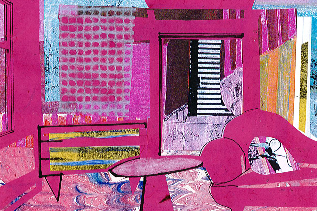
"Candy pink reminds me of something that happened at work. An executive suite was being planned on the 17th floor of a bank, including conference and dining rooms, a reception space and a room set apart for staff celebrations. This room was supposed to be gray, exclusively so, and a mouse gray was chosen – despite suggesting a more lively mix of warm gray and cold gray. While bold concepts of red-green contrasts prevailed in the other guest areas, the idea here was maximum textures. So, in our office, we decided to paint all the cabinet interiors candy pink. This included an entire built-in wall behind the bar. Two exterior walls were glass and the third was decked out in iridescent gray. We eagerly awaited the executive board’s reaction. During the morning tour, we encouraged people to open the glass cabinet in the counter area... And, after some initial hesitations and rather shocked faces, everyone began to laugh and the atmosphere totally lifted. When the bar opened, the pink came to life, glowing, making a warm impression on the previously uniformly gray room."
In this edition, Prof. Eva Filter from The Detmold School of Architecture and Interior Architecture puts the theme of color into the design focus, elevating its power.
Painter Pierre Bonnard and pink
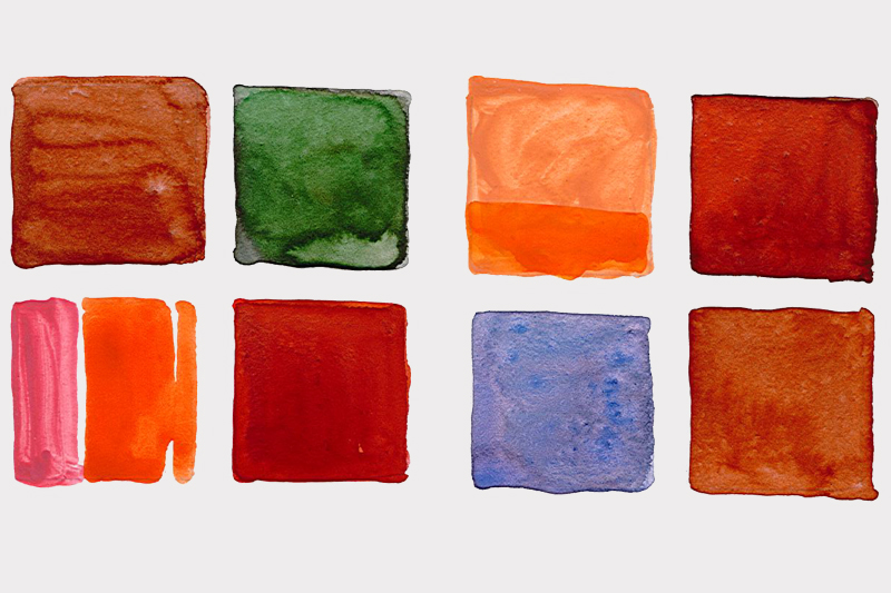
In Bonnard's paintings of interiors feature the infinite nuances of pink in flirting, impressionistic color schemes. The dialog between warm and cold tones results in the foreground and background merging, and the polarity between inside and outside, between nature and culture, becomes visible. Is it a glowing pink like parma rosa or fuchsia/magenta or rather a soft muted powder pink of a delicate shell? Or does the pink tend towards orange – salmon or peach pink, a cooler blue, such as plum pink, or to an earthy terra cotta, such as an antique pink? Time and time again, Bonnard uses a cold pink, an almost fluid, milky-cool pink next to the pink of his characters' skin.
Earth and air combine
The Turkish baths in Budapest
Which color spaces do you remember? For me, the big secret is the combination of colors and materials and what effect they have. A Turkish bath in Budapest remains vividly in my mind. Just imagine it. You step out of the changing room and cross a long corridor, barefoot on a wooden bridge. A hollow sound accompanies you. All you are wearing is a woven, white cotton wrap. Then you enter a round room through a 1.50 meter-high round arch, the periphery of which features two half-shells. A circle of round arches on stone columns surrounds the light turquoise water basin in the middle. Your eyes have to get used to the darkness and the clouds of steam that pass through the room.
The only light stems from star-like shapes in the dome vault above the water basin. You feel the warmth and hear the muffled, splashing sounds of water. It smells like sulfur and tastes like camomile. The walls and basins are covered with large, velvet-like sandstone slabs, a cinnamon-and-olive-green interplay of colors. In this archaic atmosphere, the rosy skin of the bathers and the flattened white cotton cloths seem almost like a silent dialog. The Kiraly Thermal Baths were built in 1598 – cinnamon, olive, pink, white, temperature, colors, sound, material... Everything flows together in a story-telling patina. People, with their skin color, become part of the spatial concept, where "earth and air" combine.
"Atmosphere is the magic of the real ..."
Thermal baths in Vals
"... That is the interaction between people and things," says Peter Zumthor, and when you enter his spa baths in Vals, it is an impressive spatial concept indeed. Bathers experience the changing rooms as in English ship cabins – decked out in deep red mahogany. The bluish-green quartzite used throughout the bathroom contrasts with this. The narrow-format, horizontally laid stones seem like large, linear-format plates – they line the ground also, while the walls feature more filigree layers, resulting in Cubic spatial sequences. Some of the areas are accessed via narrow, high entrances with steps and contain flower baths, where the bather dips into mineral waters at different temperatures, scented with rose or jasmine blossoms.
Iron-rich water trickles down the walls alongside, leaving rhythmic terracotta-colored traces. The falling water finds its way to open channels, to the sides of the floor plates. The soft splashing provides an accompaniment as you stroll down a gently sloping ramp over large stone slabs. In the sauna area, black leather curtains divide the zones at various temperatures and a large, black, warmed granite block serves as a seat in the center. The deliberate, choreographic highlight of the cave-like ambiance in the depth of the mountain is a far-reaching view of a green (or in winter, white) mountain world. The outside becomes part of the inner world, through color. The bodies of the bathers, in predominantly black bathing clothes, appear strangely alienated in the milky-turquoise water and probably suggestive to observers with an interest in architecture.
Atmospheric, bold color spaces
Prof. Ellen Birkelbach
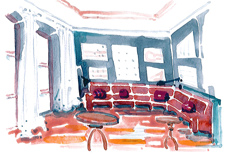
In the history of construction, artificially created color schemes were always the preference. White, gold, apple green and rococo pink, with rosewood and bluish pink. Antique pink, yellow gold or Schweinfurt green with wood in black ebony, cherry, pear and walnut, with brass and porcelain fittings in Biedermeier style. A light blue in Classicism. Between 1950 and 2006, interior designer Prof. Ellen Birkelbach created atmospheric, bold color spaces, emphatic concepts that remain vivid in our memory. Yellow leather sofas in front of an anthracite gray dark wall, a pink two-seater in front of a delicate light gray wall – the furniture becomes actors.
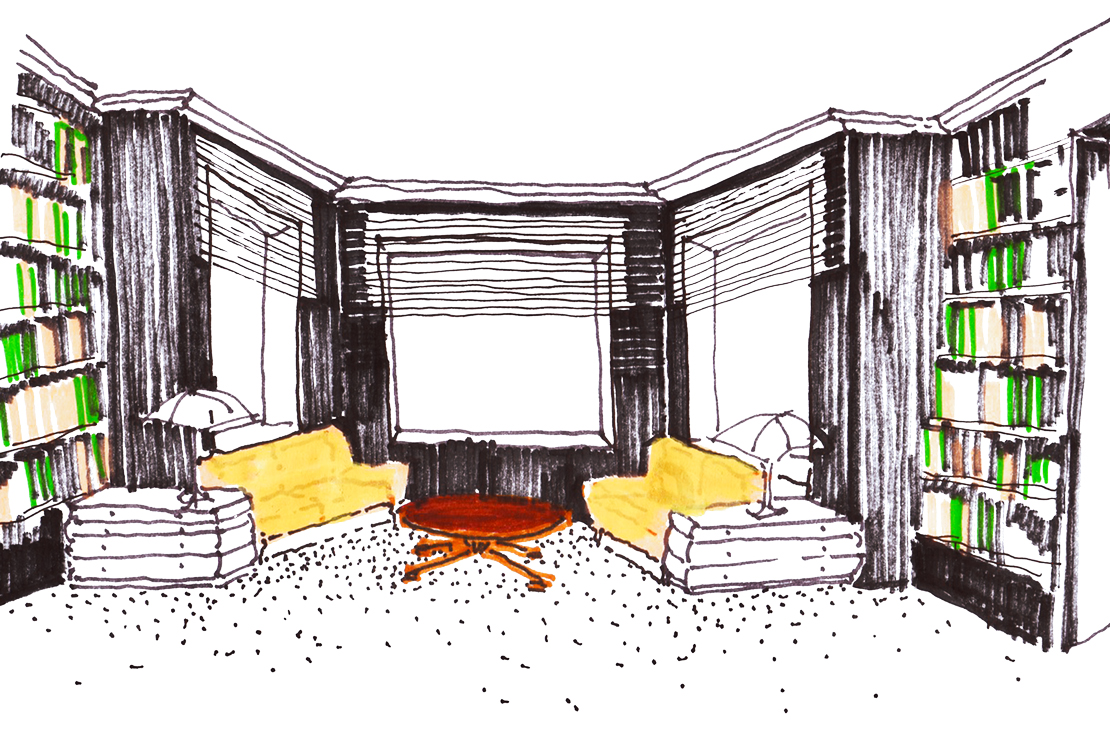
An office for the executive board
A unique, impressive design was drafted for the office belonging to an executive board member of a Düsseldorf bank. Three walls in the room were covered with a deep, dark-blue and shimmering Russian-green wallpaper. From chest height, the enormous window was framed in white paint, as were the radiator panels underneath and the door frames. Everything was carefully subdivided and proportioned, the white sparkling and fresh. A blossom-white voile in front of the window romanticized the view and completed the 'white' wall in a range of materials, from glossy to matt flowing. A desk made from rosewood, with a simple side-panel design, dominates the room. Opposite this, in front of the dark green wall, sits a sofa covered in dark green Scottish tartan, structured with olive block stripes and touches of light blue and red thread check, forming wonderfully harsh contrasts. The two adjacent armchairs glow pinky red, as does an abstract, large oil painting, enthroned above the two-seater with its low backrest. Simple cubic shapes glow in proportional harmony among a family of pink shades; orange, red, terracotta, salmon.
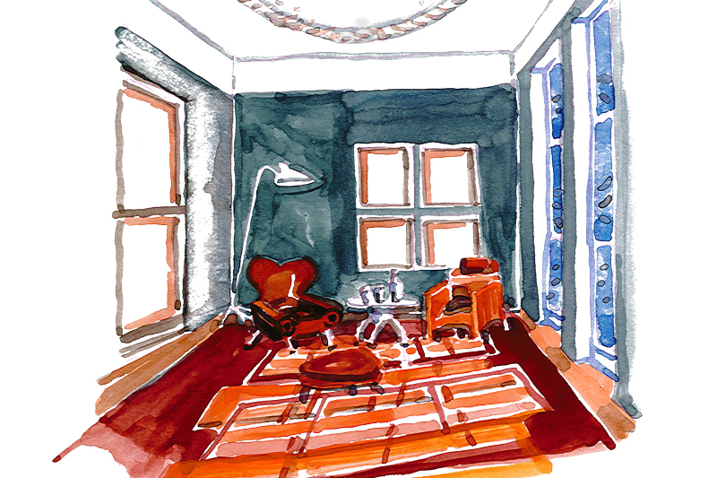
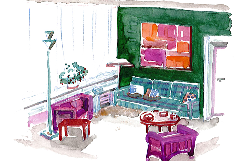
A pharmacist's private home
She also created an equally light, gentle color composition in a pharmacist's home – salmon pink, terracotta, cherry, white. Between lilac-gray walls, the piece de resistance is a terracotta-colored virgin wool carpet with salmon pink decorative elements – like the sunspots that fall into the room through two floor-to-ceiling windows, all day long. Overlaps between the decorative and real light reflections can be constantly observed as they change. Two cognac-colored leather armchairs with footstools and small gray side tables sit next to white, filigree floor lamps, a gray television set on a gray plinth table, while large watercolors in cherry wood frames hang on the walls.
In the living room, there is a terracotta, spacious corner sofa, covered with epinglé – in front of gray walls, featuring exclusively white pictures, in graphic structures and silhouettes. The gray and green iridescent wall frames the pictures, with the foreground and background creating a rich interplay of vision. An earthy red carpet with orange and pink pinstripes sets a bold accent alongside the white glass objects positioned above the backrest (greenish gray, white and terracotta, earthy red with orange and pink) of the sofa.
Spatial coloring as a spatial experiment
The breakfast room in Soane Museum, London
John Soane, the architect for the English royal family in the 19th century, mastered the facets of spatial coloring. Secondary shells within the three row houses create a magical world, which he understands as an interior spatial experiment. A dome-shaped yellow canopy braced on supports in the breakfast room of today's Soane Museum provides a view in all four directions onto orange-colored walls, which appear to describe a larger room above the canopy. This was all created to show the many exhibits of a collection, just like in a cabinet of curiosities. The intention of the room, which seems larger than it is, is also fulfilled in the four convex round mirrors, located in the four rounded tips of the canopy. The picture cabinet also has double walls, a man wearing white gloves opens them like huge shutters: Sometimes the visitor stands in front of blue-gray walls in pictures by Turner, sometimes in front of matt-green walls in pictures by Canaletto. An amazing two-layered change in atmosphere. The light comes from skylights allowing daylight to enter, and was the model for today’s museum designs. On the upper floor there is a sunny yellow painting room, with a winter garden area decorated in a bright lemon yellow, a radiant impulse in the otherwise windowless middle room. The layered facade allows for quiet zones. These brave English role models have been adopted in English culture, through interior design and architectural gardens. These gardens function as "rooms" with different atmospheres; for example, the white garden at Sissinghurst.
The fusion of furniture, textiles and walls
Charleston Farmhouse, Sussex
Likewise, the Charleston Farmhouse in Sussex, retreat of the Bloomsbury movement during the war, houses wonderfully colorful rooms. They were created by Vanessa and Clive Bell and Duncan Grant, the great English painter. Here, the colorfully painted furniture and textiles merge with the color design on the walls, where everything becomes a uniform concept. Foliage, squares, circles, paisley patterns and arabesques – among them, visual fantasies of figures, bodies, silhouettes and still life paintings. Spatial areas are color zoned, brought together again via painted structures. In her diary on Saturday, 23 August 1922, Virginia Woolf noted: "Charleston is as usual, you hear Clive screaming in the garden before you even arrive. Nessa emerges from under a large, brightly spotted aster and artichoke blanket. Not a warm reception, a bit absent-minded. Clive bursts out of all his shirt seams, sits broadly in his armchair and blubs. Then Duncan blows in, also distracted, absent-minded and incredibly wrapped in yellow vests, dotted ties and old blue stained paint coats. He has to keep pulling his pants up. He tears his hair out. But I can't help thinking that we warm to each other, instead of losing sight of each other."
The incidence of light
Chapelle du Rosaire, Vence (F)
The Chapelle du Rosaire, a small chapel in Vence on the Côte d'Azur, was designed by Henri Matisse. The floor is made of large-format, square white tiles, which have tiny blue squares at each diagonal corner. The walls feature large expanses of white, high-gloss tiles, which are painted and inscribed with very simple black line drawings of figures in the altar area and leaf motifs in the rest of the chapel area. The color comes exclusively from room-height narrow windows, glazed in shades of blue, green and yellow. In sunlight, this creates shimmering fresh color accents in the interior, on the floor, walls and ceiling. Gloss and matt surfaces reflect with different intensity, playing with the constantly changing randomness of light incidence. The color is not bound to the material surfaces, it remains independent, constantly changing with the light. Behind the altar, two high arched windows have a dark blue textile cloth motif that sets a clear focus. Matisse himself saw it as his masterpiece, which he dedicated to the search for truth.
Creating a culture of feelings
We say, "this is a beautiful color atmosphere". But what fascinates us about a color atmosphere? What means and practices lead to the production of color compositions? What is the secret sensorium of poetry in atmospheric spaces? If we try to create a "culture of feelings" as planners, then we must act consciously. Peter Zumthor calls it the "magic of the real". "Radical, strong, rhythmically differentiated, distinct, clear and rough, radiant harmonious shades, simple and transparent – like Stravinsky's music." From "Atmospheres", "Birkhäuser In Collagen", "weaving" the individual tones into a concept becomes visible, and a flowing juxtaposition of colors is created. Flowing colors connect shapes, but also differentiate things. Contrasts become visible and can be manipulated. The compaction and openness of the textures must be composed.
Green cabinet
Our office (Filter and Filter) applied a dominant color concept in the small green room, the conference room of an executive floor that can be expanded to a larger one. This multi-functional use needed clear design languages to give both rooms unambiguous boundaries. This flexibility was designed to be invisible. We overlaid the outside of the room with a colored skin in its own cubature. The sliding door, which is hidden in the periphery of the wall and is divided into several sections, has been broken up into color areas so that they complement each other, and the option to extend the room is not obvious. The design of each room is self-contained: The smaller, the larger and the entire room. If the sliding wall is opened, then both sides disappear in the peripheral wall and a large, conference-style room opens up. May green, light gray, olive green, viridian green: Leather chairs, fully covered in dark olive, sit at almost black-green tables, with lemon wood for the secret compartments of the Davidoffs No. 1.
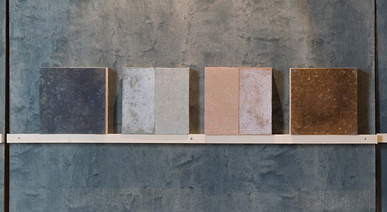
Eva Filter: "I have just fallen in love with the color cinnamon, which, in addition to clay plaster, contrasts with surfaces in light lilac blue. Warm violet blue and cool, almost Turkish blue form the perfect backdrop to a collection of watercolors and collages."