Supporting colors
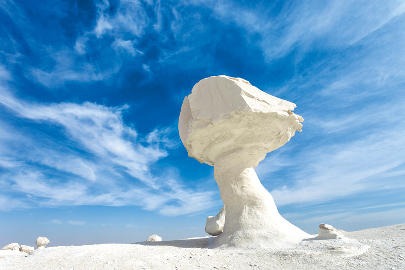
Cover image: Sample pieces made from recycled paper, pigments, and water – pressed, partially sanded, supporting colors. Master student Cengiz Hartmann
This article appeared in colore 19 #grassgreen
Order the German printed version via email at: kontakt@brillux.de
Just like a supporting wall, the "supporting" color is key to a color concept. It supports from "below"; it is a cornerstone; a “pillar” for elementary perception of color, and therefore plays a fundamental role when it comes to creating color harmony. Colors affect the senses, trigger associations, and represent emotion, if their proportions are properly balanced.
In a spatial color concept, colors should be present that enable reciprocal dominances. Colors that bring others to life, that can withstand dominant colors, and create the framework for color relationships, drawing the attention of users. Colors that offer the visual senses an exciting process of perception, that inspire memories.
"Supporting" colors are therefore not dominant colors, but instead lightened, darkened or grayed tones, which create a backdrop for lively color interplay. These could be red, yellow or blue tones, but even warm and cold versions of gray tones or nuanced shades such as green, orange or violet.

The content of the "color considerations" heading has been designed for the second time by Prof. Eva Filter, Interior Design Lecturer at The Detmold School of Architecture and Interior Architecture. The subject of color is heavily considered within the focus of design – and not just as an accent or as decoration – but as an important component when designing buildings and spaces.
-

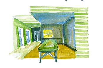
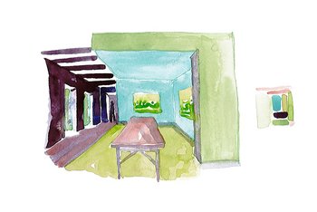
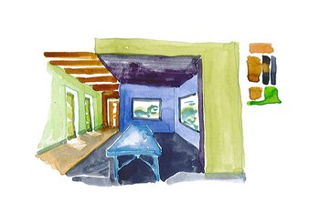
Panel paintings by Joh. Vermeer; student color studies during the 2018 master's degree program; proportions and…

A certain amount of supporting colors forms the basis for every artistic color concept. Example: If a color concept builds upon the complementary contrast between red-green and the red takes on the role of the more intense counterpoint, then it is necessary to not use the green in the same luminosity, but instead, to make it grayer, softer.
Only then does it cause the color to light up fully. Attention follows fascination, which lies in the contrast between the complementary colors of red and green and makes the lightness levels illuminate and gray out. The tension between colors remains notable, but is restrained – to the benefit of the unique color decision for the red shade.
A juxtaposition of primary colors, in equal proportions, always appears very colorful, as they compete with each other. However, if the proportions are balanced through graying, lightening or darkening, then color relationships can be brought to life in a room, and contribute significantly to implementing conceptional color design.
We always perceive comparisons between colors, regardless of whether they are in maximum contrast or in supporting/dominant relationships to each other. A blue appears lighter in contrast with orange, but a blue gray has a complementary effect when adjacent to orange.
A whole series of color contrasts is already known – but their effects on a space are not necessarily as familiar. Below is an explanation of the most important contrasts, which form the basis for an atmospheric color design, that draws its power from a deliberate, balanced mix of supporting and dominant colors.
1. Colorful, loud, powerful
These color contrasts in themselves are most pronounced with unadulterated use of the three base color shades, in their strongest possible luminosity. In equal proportions, they outweigh each other to the same extent. The strength of how the colors contrast between themselves increases, however, the more the three colors are distanced from their basic order – depending on how they are mixed, weaker and more grayed, lightened or darkened.
Here the phenomenon of the supporting color becomes clear. There are often visible surfaces in the space that consist of multiple colored parts: Shelving, cupboards, colorful collections of items. These shelving or storage systems and their backdrops require "supporting colors" to handle the color shade variety exhibited by books, dishes, and other materials. This situation requires analytical testing. Sometimes a cool or warm gray – or a glacier blue such as the shadowy color of ice – supports the surrounding variety.
Black and white are also options to ensuring a harmonious appearance in the overall concept. White weakens the luminosity of the colors and makes them darker, black enhances the luminosity and makes secondary colors appear brighter.
-

How colors contrast Red – blue – yellow, no color supports the others
-

Red and yellow become grayed and supporting, blue remains constant.


"It is not just the colors themselves, their substance is not decisive, but instead their impact. If I say that a room makes me feel cheerful, happy, festive, sad, cozy, cool or serious, then it is mainly the colors (their distribution, interplay or field of tension) that give me such impressions."
From Johannes Itten: Kunst der Farbe (Art of Color)
2. On colors and their shades of gray
The strongest expression of the light-dark contrast is of course white and black. In Itten's color wheel, black and white were not originally featured. That's why it is often claimed that black and white are not even colors. But practice shows us something completely different.
Both black and white are used to darken or lighten colors and to raise their intensity, while simultaneously giving strength to a supporting color. By changing the quantity ratios of colors, different modes of expression, such as spacial phenomena, take effect: The same brightness or the same darkness make the colors connect.
Colors are bound and grouped together through the same tonality. Adding white results in pastel tones, which are softer and finer, lighter, more ,delicate and cooler than the pure colors. All of this can be used as a means of expression within a color concept.
-

Light-dark contrast in blue. Lighter blue supports an intense darker shade
-

The mixed gray consisting of red and green appears reddish-brown and supports the lighter blue.


When gray balances out adjacent colors
Gray weakens and soothers the power of adjacent colors. It absorbs the power of adjacent colors and, due to the phenomenon of simultaneous contrast, acts as a complementary addition, which is a purely physiological correction of vision.
Through its adjacent colors, gray is enlivened and gains character, it is very easy to influence and can achieve beautiful tones, making it something very special as a supporting color in an overall look. Any desired color can be transformed from its neutral state by positioning an exciting color next to it, to achieve the corresponding complementary color effect. By doing so, the gray is impacted, so that it acts as the complementary color.
Such a simultaneous effect however is not just triggered between gray and another pure color, but also between pure colors, which are not exactly complementary. Each of the two colors attempts to impose its complementary value on the other – and generally, both lose their true character, and appear with new color effects.
3. When color cultivates a climate
Precisely defining warm and cold tones is deceptive, because each color, depending on its contrasting, can appear warm or cold with lighter or darker tones. If olive appears next to orange, olive is perceived as rather cold. Yet olive next to bottle green is interpreted to be warm. The optical range of color sensation always results in a temperature sensation.
The polar force of the contrast between turquoise and olive, pink and cadmium red, ultramarine and violet, lemon yellow and sunflower yellow... The same violet can appear both warm and cold, if the adjacent colors are warmer or colder. If violet is placed next to viridian green it appears warm, yet adjacent to mauve, it appears cold. Cold colors appear transparent – they are mostly used in too light a shade. Due to their opacity, warm colors are often selected too dark.
In a warm-cold contrast, gray becomes the supporting color, because it has the simultaneous effect of calming a pure color, and nevertheless, visually enhances the color tension (between gray and the pure color). In its position as a supporting color, gray makes it possible to use illuminating colors in the space.
-

Cold-warm contrast. Olive/grass green and turquoise/grass green is surrounded by grayed red as a carrier color, then…
-
-
-


4. They contrast richly with each other ...
... and within a room, look unbearable when positioned next to each other. In the color wheel, it becomes clear that yellow, the brightest color, is at the top, violet, the darkest, is below. The strongest light-dark contrast lies between these two colors: red orange and blue green. Complementary colors always result in a neutral gray-black when mixed together. Complementary color shades behave strangely. They are contrasting colors, increase to the highest luminosity when next to each other and 'destroy' each other like fire and water when mixed, resulting in gray.
For example, this graying of red with the complementary color shade of green and green with the color red, enable a viable color concept. Complementary color shades are in a relationship where they share a certain tension and complement each other; red wins due to the contrasting effect of expressive power, when surrounded by green. Green shows its true beauty against a red background.
The complementary law is the basis of harmonious design, because when these colors oppose, the result is holistic color harmony, perfectly balanced to the eye. That is the goal of our color sense. The complete contrast of red/green can hardly be envisaged in a room, but the grayed complementary color shades create spatial harmony.
In Delacroix's work, the colorfulness of the shadow is always in the complementary color: The yellow carriage in front of violet shade, but both are grayed and therefore full of tension. This complementary contrast can be used spatially.
Based on meaningful use and architectural features, choose which of the colors should be dominant, and don't combine them with a grayed black, but instead, the grayed complementary color shade.

Other contrasts appear less effective in their supporting, rather than proportional properties:
The quality contrast describes the purity and degree of saturation of the colors, the ratio of saturated bright colors to dull, gloomy colors. Lightened or darkened colors lose their brilliance, but gain supporting capabilities when it comes to the contexts of rooms.
The quantity contrast shows proportions of the colors to each other and in the true sense, is a proportional contrast. With red in small quantities, mixed with green, for example, the color in the minority appears brighter than when they are both present in the same quantity. In this case, the surrounding color becomes the supporting color (in this case, green). Luminosity, purity, mixtures, and quantity determine the effect of the color in the room.
After all, despite all the contrasts and these examples, the different color effects depends on how they are used and handled. So, do you trust yourself to make the most of these grayed tones and observe the effect on surrounding colors, play with the effect of contrasts, in order to create and perfect spatial color compositions and unique color areas?