Color considerations and spaces
This article appeared in Colore 18 “himbeerrot” (raspberry red).
Order the printed version via email at: kontakt@brillux.de
Photos: Hochschule Ostwestfalen-Lippe
Color reality refers to the physical, chemically-definable, and analyzable pigment of color, the dye. Color effect is the psycho-physical reality of the color. In contrast to the color reality, the effect of the color is all based on perception. Color lies somewhere between rational categorization and emotional perception.
As designers of interior concepts, we do not aim to achieve color reality (three kilos of scarlet paint!) – but instead, to achieve a color effect. The dimension of the color, its proportions, the size ratio of the color surfaces in relation to each other, the relationship between the colors, their extent and position, dimensions, the color density and transparency are all relevant to how the space is experienced. Artistic color concepts where spatial energies are manifested make space for an additional, separate dynamic, leading us to perceive these spaces as even “richer”.
In the future, for the COLOR CONSIDERATIONS section, Prof. Eva Filter (Interior Design Lecturer at The Detmold School of Architecture and Interior Architecture) is to summarize articles on this point that bring color more into the focus of design as a topic in its own right. This thorough examination encourages a sense of wanting to learn more, inspiration for something new, and raising awareness of the power of color.
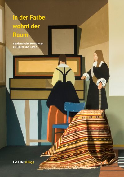
Brillux has been the sponsor and patron of the university for some years now – recently, the exhibition of master and bachelor works "In der Farbe wohnt der Raum" (“The space lives in the color”) was undertaken together with accompanying publication of considerations, which are absolutely vital when handling color.
Prof. Dipl.-Ing. Eva Filter, The Detmold School of Architecture and Interior Architecture
Standardization was always the way to scientifically record colors, to formulate generally valid parameters for universal understanding. The need to name colors began with the industrial manufacture of pigmented dyes. There are a surprising number of models attempting to categorize the colors we see in various ways. To name just a few: There was Goethe’s color wheel, the Delacroix chromatic triangle, the Blanc and Ziegler color star, Young’s organization of a coordinated system, the Munsell color tree, the Ostwald color system, and last but not least, the CIE diagram and the NCS system. Each of these tried to assign order to perception. Factors that should be taken into consideration as part of color analysis are the light, the eye, our brain, the texture of the material being considered; these are all factors to be considered in the causal chain. Many of the earlier models have explanatory approaches that don’t take light into account and therefore ignore a fundamental value of how color appears.
“The light that illuminates colors changes them dramatically; in candle light, blue appears green, and yellow, white. In weak daylight, a medium blue appears white, as it does at nightfall. Painters know the colors that shine more strongly in candle light than in daylight; there is also a series of colors that are very bright in daylight, but lose all their beauty in candle light.” (taken from E.P. Fischer: Die Schichten der Farben (The Layers of Colors)).
The color of the light affects the color of the material. Light color and material color are dependent on each other, but differ in their basic appearance. A building can transmit its volume, proportion, and structure from outside, through the interplay of light and shadow. An interior room bathed in a soft light, depending on the large areas and the objects around, can be experienced through its color shades and textures. John Locke (1632-1704, English philosopher: Theory Of Perception) differentiated between the primary and secondary properties of objects:
The primary properties of size and form are perceived objectively, relatively independent to subjective sensations. Color, texture, noise, and smell are perceived in a highly subjective manner.
John Locke (1632-1704, English philosopher: Theory Of Perception)
Ruskin expressed this as follows: “Light and shadow imply understanding of things – color, however, the notion and feeling. In the morning light, a color appears cooler than in the evening. Color is always experienced subjectively and emotionally. Albert Munsell was one of the first to include light directly in his considerations. In 1905, in his famous "The Munsell Book of colors” he presented (relatively) stable pigments. Today's version has 1500 swatches. Munsell produced it himself. If someone wishes to compare a color they have in front of them with a Munsell swatch, this should be done under the light of the northern sky; as would be the case on a bright spring day in New York City. Otherwise, despite all the accuracy and diversity of the configuration, misunderstandings could occur. In 1810, Johann Wolfgang von Goethe published his color theories, including the color wheel. He stressed the idea of polar opposites and drew upon his experiences. He put yellow and blue, green and purple, plus and minus, warm and cold, near and far opposite each other as contrasting pairs and assigned the colors to certain properties.
From two-dimensional painting to a three-dimensional space
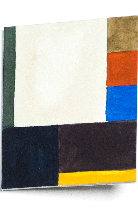
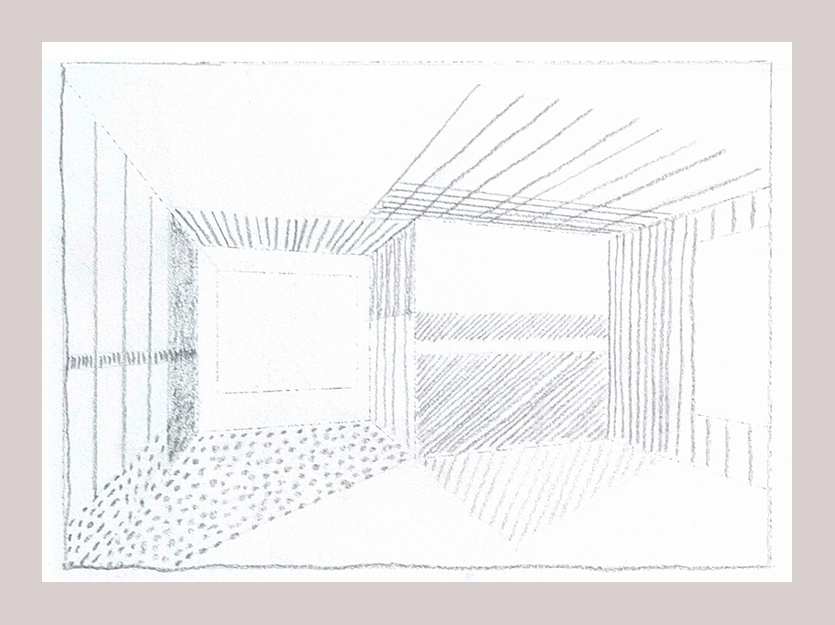
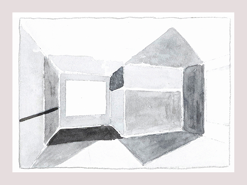
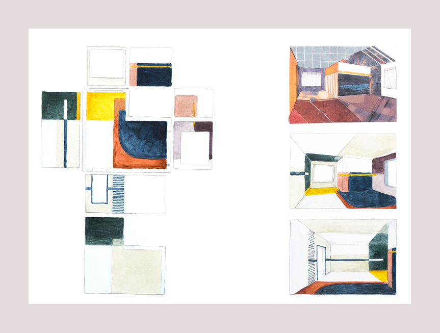
Prof. Eva Filter demands precise observation, a delicate sense of feel, conscious change, and a systematic ability to adapt from her students. The shown in parts of the masters’ work by Laureen David contain the following steps: Extensive research on old and new painting styles, the analysis of spatial structures of a particular image (here, the “Music Lesson” by Jan Vermeer, 1632-75), thoughts on action and orientation zones, capturing the color perspectives and contrasts, development of individual color concepts, surface studies, transfer to a model, recording conceptual thoughts on function and use of space, exhibition concepts for the university spaces, documentary preparation for the exhibition catalog of “In der Farbe wohnt der Raum”.
A limited number of exhibition catalogs can be ordered free of charge from kontakt@brillux.de.
-

The color concept in the Vermeer room is marked by experiences from two different places.
-

The contrast between light beige and purple shades, to the dark gray and earthy tones is very noticeable here.
-


Color spaces
The objective of artistic spatial planning could be to create energy from color in a space and to use it so that the space gains a certain expanding aura. A rational decision on building design, such as painting a fire wall red, is based on the supporting structure, and reinforces this. It does not do justice to the primary phenomenon of “interior space”, which one enters and experiences individually, as a third skin. Room elements are selected individually, without considering the use.
In his book “The Art of Color” ("Kunst der Farbe"), Johannes Itten describes various color phenomena. Among other things, he discusses the color contrast in itself, the light-dark contrast, cold-warm contrast, complementary contrast, and contrasts in quality and quantity. The phenomena looks at the effect that these colors have on people. For example, color with the effect of perspective:
“The spatial effect of a color can depend on different components. In color itself, there are forces that take effect depending on depth. These can appear as light-dark or cold-warm, or as quality or quantity. If six colors, namely yellow, orange, red, violet, blue, and green are aligned together on a black background, you can clearly see that the bright yellow seems to come to the front and violet disappears into the back of the black background. All the other colors create depth levels between the yellow and purple. If a white background is used, the depth effect changes. Violet jumps out from a white background and seems to come forward, whereas white holds yellow back, perhaps being too closely linked.
What are the decisive influences that measuring color has on a space? The prerequisites for this can be found in human perception. Within us, we all carry a general archetypal color wheel, from which we experience everything colored around us with an emotional quality; vice versa, we can also express our feelings using this color. Add to this an individual range of psychological influences of color and color harmonies, independent of the current mood – potentially modified by certain stages in life – and depict the spiritual identity of a person.
Architects think about color – painters think about spaces
Color surfaces, whether two- or three-dimensional, are linked to each other. This structure has a noticeably higher atmospheric message, than using an individual tone alone. In her London exhibition in 2017, Hella Jongerius called this "Breathing Colours". The room is divided into spaces, the use of which can be compared to “emotional spaces” in artistic design concepts, where those entering undergo characteristic experiences. Here, it is above all about color and structure, density and intensity, openness and lightness. A space does not need the colors that give psychological impressions, but instead the colors that make an overall impression on the design, corresponding to life experiences. The aim of good interior design is for users to connect with spaces, with the principle of coherence: To inspire a mood and feeling, that simplifies dialog between people and the space, that removes distance. The sense of balance is perceived by all those involved, it must be balanced, as a range of sensations are connected; room shapes connect to the lightness and the intensity of the color. The natural balance between dark and light colors is what nature provides. Dark flooring, lighter surroundings, an even brighter sky. This natural upwards progression forms the basis for a balanced wall-floor-ceiling ratio, a vital principle in the promotion of the earthiness or the feeling of a steady footing.
-

Space model, from Laureen Dawid’s master thesis.

Sottsass writes about his own feelings surrounding colors in his childhood memories:
“I remember the colors of all these things in nature so strongly, I remember the ultramarine blue of gentian, the yellow of buttercups and wasps, the orange of lilies, the red of raspberries and all the other colors ... and now, that I’m grown, I still remember this, but now the colors have a name. But when I was small, the colors were the things themselves, they were not “colors”, instead, they were wasps, raspberries, mushrooms, flowers, and nothing else. And when I was small, all these things of nature, together with their color, also determined their size, smell, taste and even their rarity. (...) The world was made of animals, mountains, (...) and each thing was simply that which connected it to its color. Then, no color existed for me, nothing was “disengaged”, in my catalog of perceptions, discoveries, knowledge, there were no “disconnected” colors, abstract colors (...), the colors that are classified that “Pantone” now refers to, these “scientific” colors, still don’t exist for me today.”
If color surfaces create harmony in a space, if they divide the room into zones, that differentiate in rich color contrasts – if contexts can be created between function, shape, and color, then spatial color design leads to an experience and provides the user with resonances, leading the user to identify with its beneficial characteristics.