A vibrant color needs a powerful reason
photos: Nicolas Borel
This article appeared in the colore 19 #grass green.
Order the printed edition by email at: kontakt@brillux.de
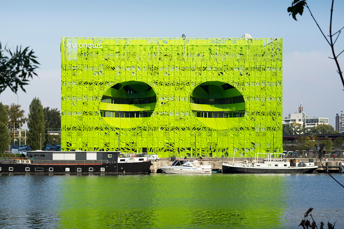
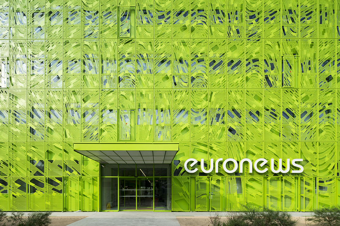
The headquarters of the Euronews channel has moved into a new home inside the unparalleled Green Cube in Lyon. The building shines from afar in neon green, two “eyes” peer into the water, the perforated body shell absorbing the undulations of the Saône River.
First it was the Orange Cube, just a few steps away, and now the architectural practice of Jakob + MacFarlane has created a second iconic construction in the former industrial park. We spoke with Brendan MacFarlane about the Green Cube, the power of color, and the beginnings of a success story.
What is the context for the relation between the Orange Cube and the Green Cube?
Brendan MacFarlane: Both emerged from the same tender for construction of an abandoned dock. Proposals for either one or both of the available premises were requested. We opted for the two and built on an idea that works at both sites. Lyon is based on the principle of an Italian Renaissance city. There are lots of fantastic, open spaces, and a stroll will take you from one to the next. Cities are connected to their people. People make the connections by moving around and finding out about their city. We wanted that to continue at the river. In addition to this idea, we played with repetition. Now when people walk along the river on the boardwalk, they first see one cube and then the other, thereby also seeing an ensemble. Along with shape and workmanship, they also encounter the holes in both structures, which are opened for air and light. We have thus created two buildings which stem from the same conceptual framework.
Orange and neon green are very vibrant colors. How did you choose them?
Brendan MacFarlane: There are different reasons for choosing these colors. Initially there were two themes for the two structures. The Orange Cube is entirely dedicated to the topic of gastronomy – Lyon is famous for its outstanding cuisine. The Orange Cube contains a "School of Food", a library specialized in topics like catering, etc. Here we opted for the vibrant, active and warm orange. But we also selected this color as a link to the industrial past, because orange harks back to the color of industrial tools. What's more, this former industrial site was once gray, black, and dark, and we wanted to open it to light, to people, and to the joy of strolling. The unique and calming green, in contrast to the orange, stands for peacefulness, the water, the river. The theme of the the Green Cube is, after all "Relaxation". Originally we proposed, for instance, setting up a swimming pool in both lower floors. In the end we selected two luminescent colors, because in France buildings on water are usually painted in bright colors for reasons of shipping traffic safety, so yellow, orange, or red.
The body shell of the Green Cube has a dynamic effect. How was it made?
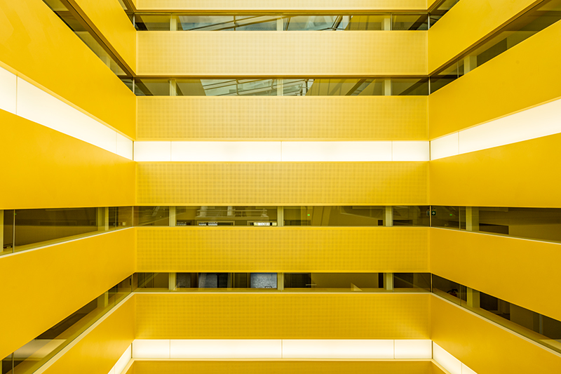
Brendan MacFarlane: There are two layers. First there is the water-proof level, consisting of flat green panels and with open-worked horizontal ribbon windows. It is a bit darker than the outer layer. The “outer skin” is a bit lighter green, at a distance of 25cm from the inner one and perforated. The perforation patterns come from the artist Fabrice Hyber. This layer has two functions: on the one hand, it shapes the identity and, on the other, provides protection from the sun. This is true for both buildings, by the way.
How much power does color generally have?
Brendan MacFarlane: Color is very powerful. I believe it is one of the most important elements with which architecture should work. Many architects are reluctant to work with color, which is absurd, because it is fantastic to create with it. In architecture we tend to move within a spectrum of white, gray, and black, and somehow neutralize space. It's easier to relate something neutral to what already exists. That’s playing it safe. Color is potent, but also portentous. We only use it where we consider it important. Of course, we also make color-neutral buildings, if we consider it appropriate. When we work with color, we have good reason to do so. We place great value on color selection for a building. If a vibrant color is involved, then there must be a powerful reason.
Someone with a general interest in colors is interested in all colors. The question is when and how to use them. If this has been internalized, one is open to the entire spectrum.
Brendan MacFarlane
A private question while we're at it: How do you use color at home?
Brendan MacFarlane: The way I live might be the opposite of what you expect: boringly neutral. It is relaxing. The design of our private spaces need not make any great statements. It is easier to create something for others. I have only two Buddhas, which I bought in Vietnam, that have the same colors as the Cubes and sit on my shelf. The Cubes had an enormous influence on our lives when we worked in Lyon, we received feedback from around the world. When I saw both Buddha faces in the exact same colors, the purchase was made as a joke. Humor is really important in life.
Tell us about your modus operandi and the specific approach in Lyon.
Brendan MacFarlane: We always closely examine many aspects of a new project, in this case the history of events on the river. There were storehouses for wheat and sand, among other things. Half of the buildings on the river were torn down to make room for new construction. In the past, most boats came from central France, and the rivers were highly industrialized waterways, very different from today's rivers. The areas on the waterways were used for commerce and industry. Lyon is a city between two rivers – the Rhône and the Saône. So the city has always had a link to water, but the rivers were not considered something beautiful, like in London. They were used industrially and considered purely functional. Of course, there are bridges, shores, and places to take a stroll, but the movement and presence of the rivers was never really celebrated. Now the challenge was to create office buildings which would boast an iconic quality. The public would walk along the river. It had to be actively managed, and there was much to consider: historical background, the Saône and Rhône Rivers with their different characters and colors. We saw and discovered many things during the conceptual phase, carried out a type of archiving, and built a narrative. Everything came together peu à peu into a concept. The two buildings take in the life, the lights, the movement of the river – and they face the water, not the landscape.
In recent decades and around the world, industrial sites have been repurposed. Can you give an example of what you especially appreciate?
Brendan MacFarlane: Over the last 20 years, former industrial sites in Europe have probably provided the greatest freedom to undertake exciting things. There are many interesting projects bordering rivers and waterways, sea routes, and shores. For instance, I particularly like the Elbe Philharmonic Hall, because it speaks a fascinating architectural language on a historic industrial waterway. The roof certainly has a special quality, “cut” into 3D domains, as we did with the Cubes. Another outstanding example of a repurposed former industrial location is the Hudson River Park in New York. Apparently many different actors worked together here to bring out the best - sustainable, sensible and innovative. It has resulted in leisure and sports programs for all ages, a real pleasure.
The Elbe Philharmonic Hall is truly emblematic. When should a building be an eye-catcher? When should it rather be understated?
Brendan MacFarlane: It is always a top priority to properly plan a site, including with respect to color. We humans create a huge number of very banal and neutral buildings all over the world. We should be more creative and less neutral. I believe that the built environment can bear much more creativity than we suspect. If you look at the cities of the past, they are considerably more interesting and rich than what’s built today. Look at medieval cities, or those of the 19th century. Fantastic things happened. Today much of it seems overly neutral and therefore boring. But the question is also; am I proud of what I have created for my kids or other people’s children? Can I create magical moments? Ambition is severely lacking here. We should bring our instincts and vitality into play when we plan our cities, in order to allow variety. Neutral cities make us aggressive toward anything different, and that’s a big problem for humanity. That's why my plea to all the creatives is to be brave and create the environment of tomorrow.
You decided early on to be one of these creatives who develop the environment. What was the most important lesson you learned in your studies?
Brendan MacFarlane: An important experience, perhaps the most important: moving, traveling, seeing architecture. Today many students take it for granted. I did that because I noticed the huge influence it had on me. My path as a student took me from New Zealand to Australia and Los Angeles. It’s not about sitting in a studio and drawing, at least not as a high priority. It must run parallel. There was a lot of original construction when I went to Los Angeles in the beginning of the 1980s. I drove around with other students to look at projects under construction. That had a big influence on me and my work, and was a big part of my education.
You also traveled around a lot later. You mentioned a trip to Vietnam. Which country-specific architecture inspired you the most?
Brendan MacFarlane: When I flew to Vietnam, I was really inspired by Ho Chi Minh City. It began in the approach to landing. When flying at low altitude over the city, you see many - largely faded - colors: an unbelievable spectrum of blue, green, and yellow tones. Interestingly the yellow, unlike the other colors over there, is not usually pale, but quite vibrant. There are very vibrant and somewhat pale Asian colors, among them tones of brown and red, too. The city is like a patchwork of low buildings, consisting of materials and geometries laid on top of one another. All of this makes up this interesting and inspiring city, which quite reminds me of Mexico City. There too, the inspiration begins in the approach by air. And as the city opens from the air, it opens wider on the ground. The cultures in these countries had the freedom to plan the city over time, without coming to emotional disruptions. There is a certain joy in such a blend and complexity.
Is this original, patchwork construction also thanks to the fact that there are less restrictions than here?
Brendan MacFarlane: Presumably. I think all architects should break some rules every now and then. When you come across innovative city planning, which is seldom the case, it’s pure joy. It can also be very inspiring when landscape architects and city planners creatively collaborate. Ideally there are no restrictions with regard to material, color, and building openings. As an architect we yearn for this kind of freedom. Ultimately we create living space. Restrictions lead to neutral, coarse surroundings, which is depressing. In the end it’s about providing room for creativity.
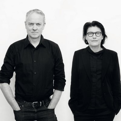
Jakob + MacFarlane Architects is an architectural practice headquartered in the French capital Paris. At the core of its work is a permanent search to reinterpret a place, thus the method of operation is always determined by researching context, in order take the appropriate approach to a given situation.
Dominique Jakob, born in France, graduated from the Ecole d'Architecture Paris-Villemin (1991), after studying art history at the Université de Paris (1990). From 1994 to 2004 she taught at the Ecole Spéciale d'Architecture and the Ecole d'Architecture Paris-Villemin and Malaquais. Together with Brendan MacFarlane she founded in 1992 Jakob + MacFarlane Architects. She has been Consulting Architect with the city of Toulouse since 2013, and was a member of the governing board of CNAP (Paris-La Défense).
Brendan MacFarlane, born in New Zealand, earned his doctorate at the Southern California Institute of Architecture (Sci-Arc) in Los Angeles (1984), and graduated with a master’s degree from Harvard Graduate School of Architecture in Boston (1990). He taught at the Bartlett School of Architecture in London, at the Ecole Speciale d'Architecture in Paris, and at Sci-Arc in Los Angeles (2006). He is regularly invited to take part in conferences and as a juror at events worldwide.
Portrait photo: Alexandre Tabaste photographer