
Mineral wall design
Wall designs with natural-based products like limestone and marble powder are extremely popular due to their many positive properties: They are free from preservatives and have a positive impact on the indoor climate thanks to selected, natural raw materials. The high alkalinity of the products based on limestone does not act as a breeding ground for mold spores. All techniques for mineral wall design are based on the products Creativ Algantico 70 or Creativ Sentimento 78.


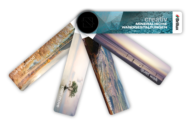
Creativ Mineral Wall Design Color Charts
Mineral wall design color charts – 2021 edition
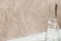
There are numerous different ways to design walls. Designers can choose from products with options for shades of colors, textures, ornamentations and degrees of gloss. Many designers opt for mineral products when choosing their creative wall designs in private residences and prestigious public buildings. The natural materials limestone and marble powder give the wall a surface that not only feels nice to the touch, but also - thanks to the increased pH value - successfully inhibits mold infestation.
Mineral products are generally rather matt or silk matt; depending on the chosen application technique, they can also be polished to a high gloss. The range of possible looks that can be achieved is extended significantly thanks to the numerous techniques. Our two basis products, Creativ Algantico 70 and Creativ Sentimento 78, allow you to achieve a wide range of designs. While Algantico is used in traditional Venetian plastering techniques, Sentimento is suitable for both full-surface and subtle plastering as well as for protruding textures that are refined with siliceous highlights.
The new mineral wall design color chart is inspired by modern interiors and includes a wide range of contemporary color shades. In compiling the color chart, it was important to us that the color shades fit the character of the coating materials. We rely less on luminosity, but rather on restraint and the powerful impact of slightly grayed shades. It should always be possible to combine vibrant colors and suitable gray nuances.
To help you easily find the best-fitting combinations, we have created thematic worlds that go together in harmony and feel complete, while also allowing color shades from different worlds to be combined.
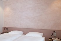
quiet walk
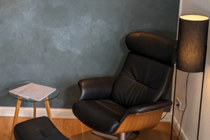
For a calm and serene mood, here it’s all about slowing down. In terms of colors, we rely on light nuances of calming green and warm blue, while reminiscing the end to a relaxed late-summer day.
- Left wall: Creativ Sentimento 78 using the fine texture application technique, color shade 30.MI.12.
- Right wall: Scala 48.06.15
- Floor: Design Floor Covering in Decor 461
solid hike
Vibrantly enjoy nature. The perfect feeling of freedom comes from fresh air and expansiveness. The colors are inspired by mountain-top flora. The shades of red are based on earthy green and ocher and can be complemented by stone gray variants.
- Right wall: Creativ Sentimento 78 using the coarse texture application technique, color shade 21.MI.15.
- Left wall: Scala 81.06.09
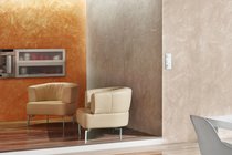
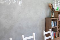
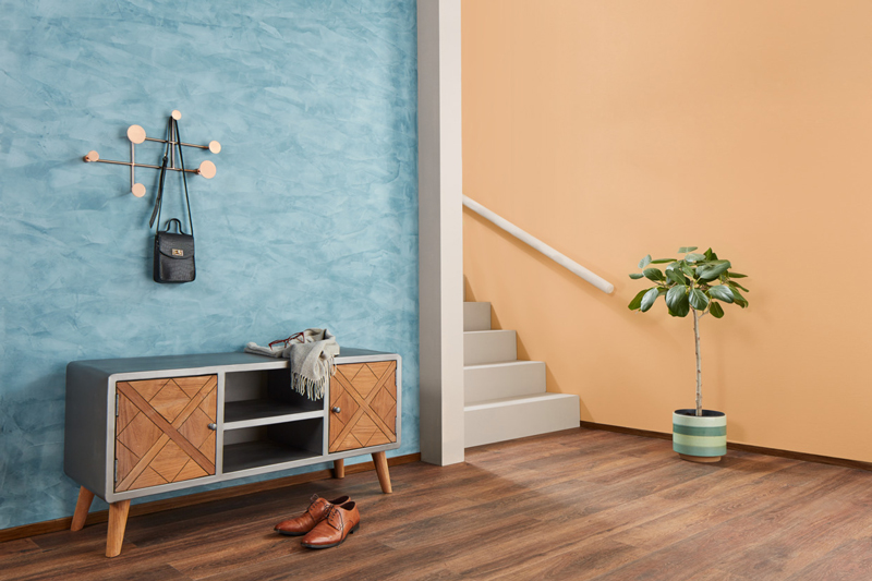
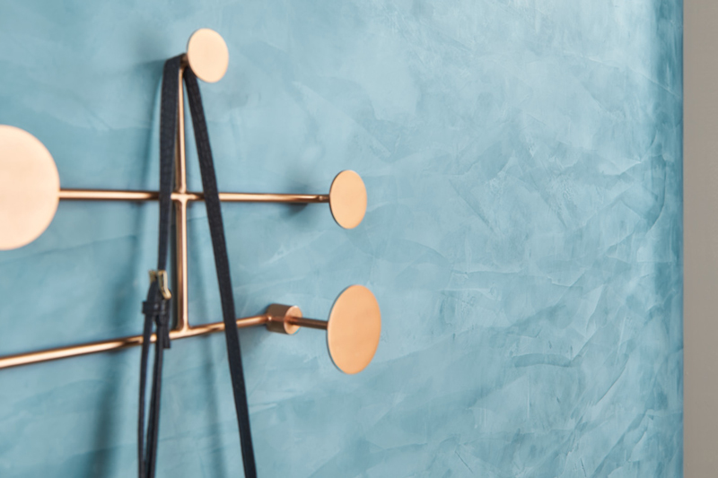
plain move
Here, everything is in a state of motion – this theme world can be characterized as flat and linear. Blue-green accents combined with unpretentious earthy options give off a feeling of cool objectivity.
- Wall: Creativ Algantico 70 using the stucco application technique with polished surface, color shade 81.MI.09
powerful turn
This theme world can be described as energetic, powerful and having a strong contrast. Yellow and red-orange evoke memories of warm sunshine. The use of clear water blue creates a dynamic ensemble that is rounded off with suiting gray nuances
- Left wall: Creativ Algantico 70 using the seta application technique, color shade 63.MI.06
- Right wall: Scala 12.12.1
- Floor: Design Floor Covering in Decor 467
Creativ Reflecto 181
Creativ Reflecto 181
Reflective, glittering grain size for an optional addition of further, effective surface revitalization for Creativ Sentimento 78. Creativ Reflecto 181 is particularly suitable in the Creativ Sentimento 78 application technique as a fine texture.