Into the blue
Photos: Jens Weber and Orla Connolly
This article appeared in colore #himmelblau
Order the printed version via email at: kontakt@brillux.de
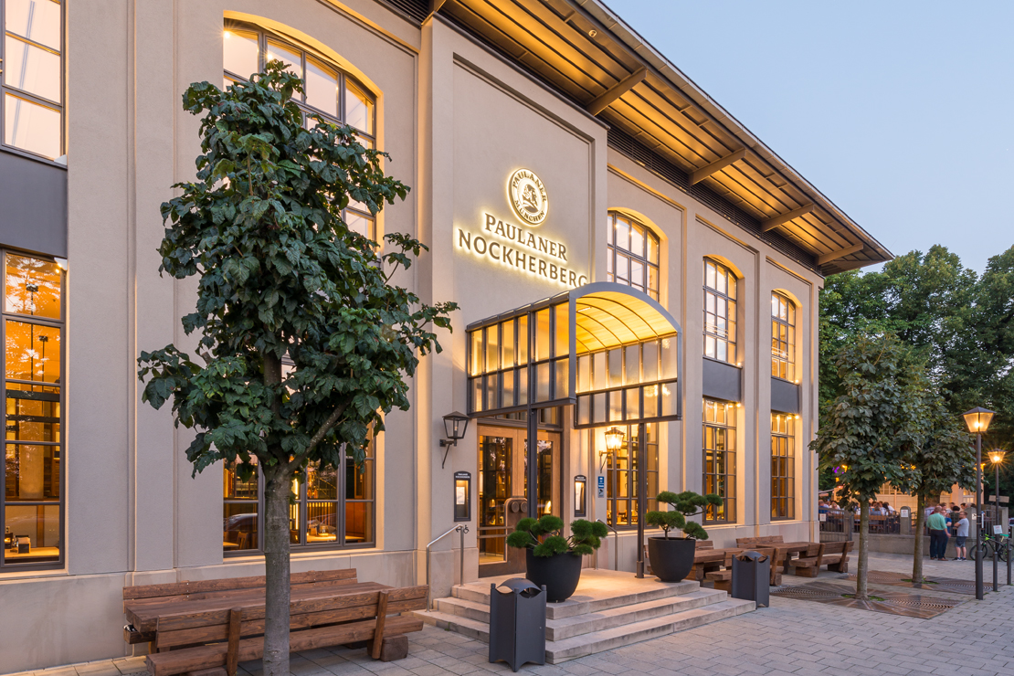
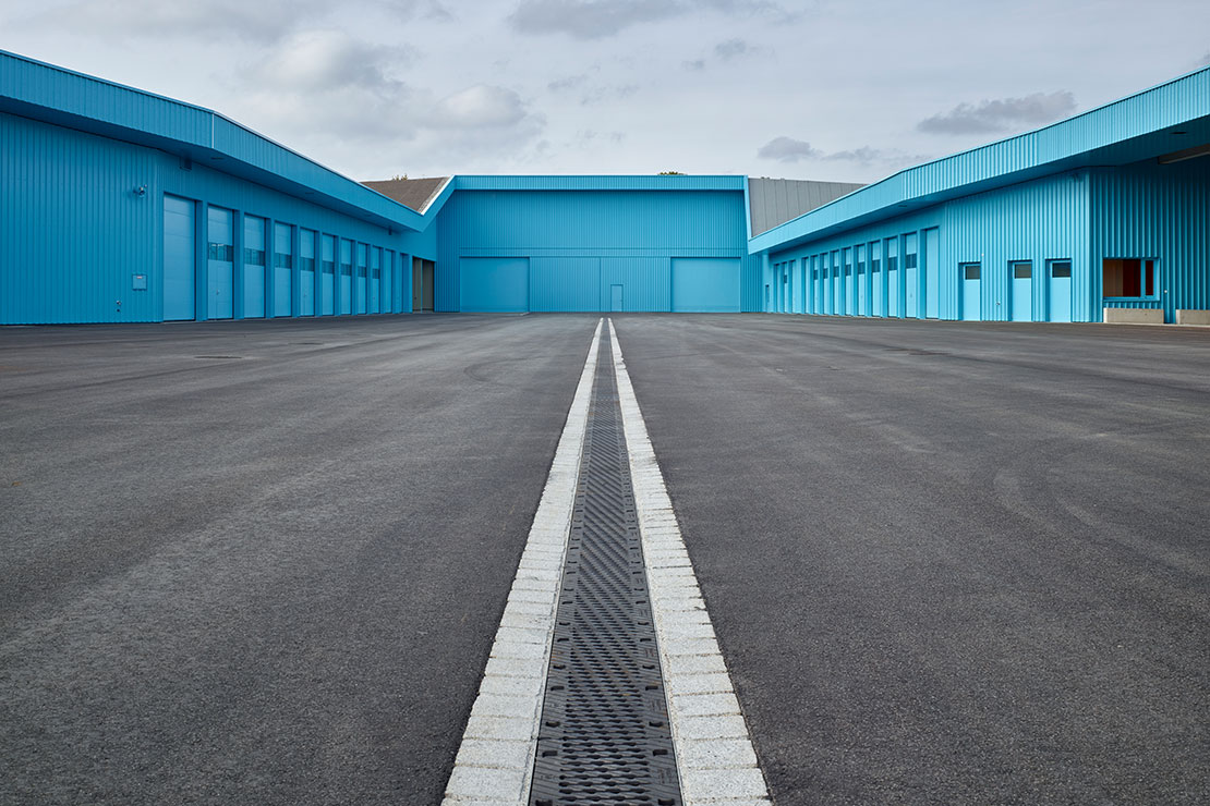
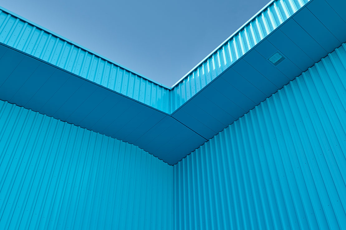
Tall, grained wooden lamellas stretch up high towards the sky, before jutting outwards, then back in again. A few meters past an allotment, peep round the corner... And a huge, bright sky-blue building opens up, surrounding a spacious inner courtyard – as if it were a broken precious stone that only shows its beauty from the inside out.
The reconstruction of the Nord recycling and cleaning depot in Augsburg was designed by the architectural firm Knerer und Lang, to provide the different functions required from a suitable premises, while creating a contrasting stage for the numerous employees.
Object | Site: Augsburg recycling depot
Architect: Knerer und Lang Architekten, Munich
Prof. Thomas Knerer
Dipl.-Ing. Eva Maria Lang
Photography: Jens Weber and Orla Connolly

Pioneering and sporty
Olympic blue – a color with its own history and a very special origin that grabs all the attention with its presence and brightness. The sky blue shade was conceived by artist and head of the College of Design (HfG) in Ulm, Otl Aicher, who among other things, designed a signpost system using pictograms as part of the Olympic summer games in Munich, 1972.
The main color? A radiant blue. This blue tone appeared time after time, in brochures and fliers, tied to other Olympic games. Aicher was looking for a color that was strong, airy instead of weighty, for the design. That was how Olympic blue became the most recognizable color of this sporting event and gained its now logical name.
The architects at Knerer und Lang also made use of the characteristics of this special blue, painting the courtyard facade of the recycling depot in Augsburg in precisely this Olympic blue. However, it is not just the color itself that has a connection to the Olympic games. The city of Augsburg also has ties to this event, as it hosted the canoe slalom in 1972.
Rich in contrasts
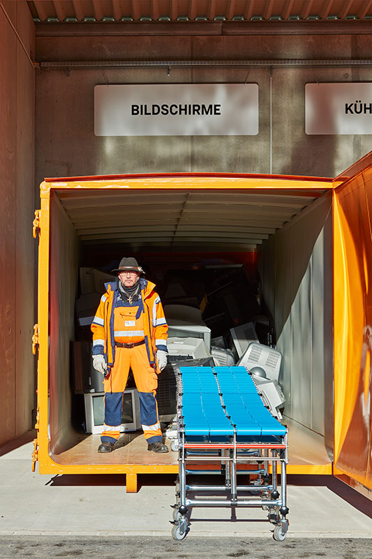
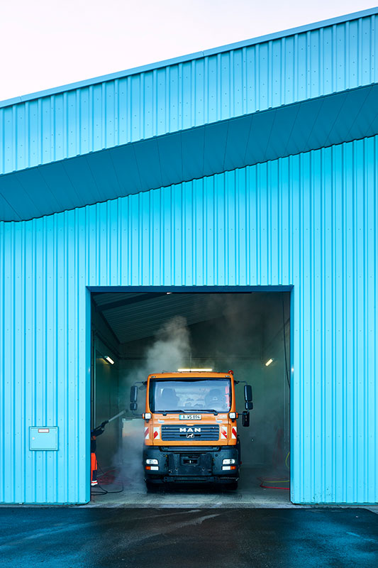
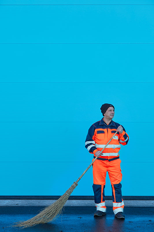
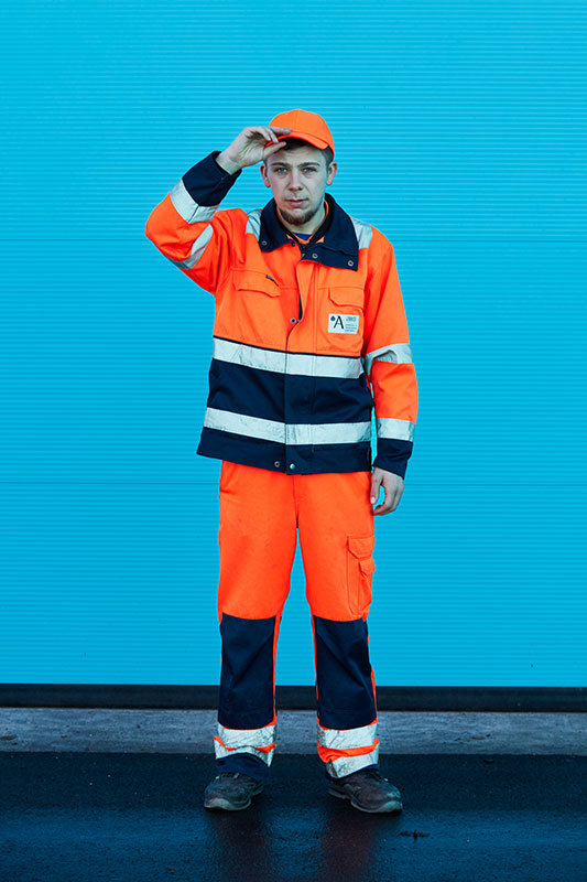
And although this was in fact reason enough to select this shade, the architects also looked at the color choice from an entirely different perspective. Employees move around the site every day boasting highly recognizable orange workwear; a bold, eye-catching, strong shade. And since the work of these employees is what matters most, "we chose a color that would contrast strongly to orange," explains architect and professor Thomas Knerer in person. It needed to be a color that honored the employees and their work, highlighting them, making them stand out. Orange and blue both speak for themselves, while simultaneously enhancing the effect of the other, they are lively and form a perfect contrast. "We wanted to reject the cliché that modern architecture always has to be white or gray – because color also offers its own unique opportunities."
We use color to assign identity.
Prof. Thomas Knerer
Softly cushioned
While strong colors compete inside the courtyard, creating a lively piece of art, the building itself is harmoniously embedded in its surroundings when viewed from outside, and even appears to meld into it.
The vertical wooden lamella facade is like a wooden slat fence surrounding the exterior skin of the building, lending it a natural appearance, which at first glance, gives no hint of the exuberant colors hidden inside. Framed by allotment gardens, a street, the highway, and a rifle association club, the recycling depot appears proud yet modest to its users and workers.
Under the covers
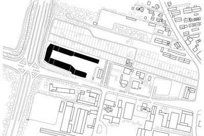
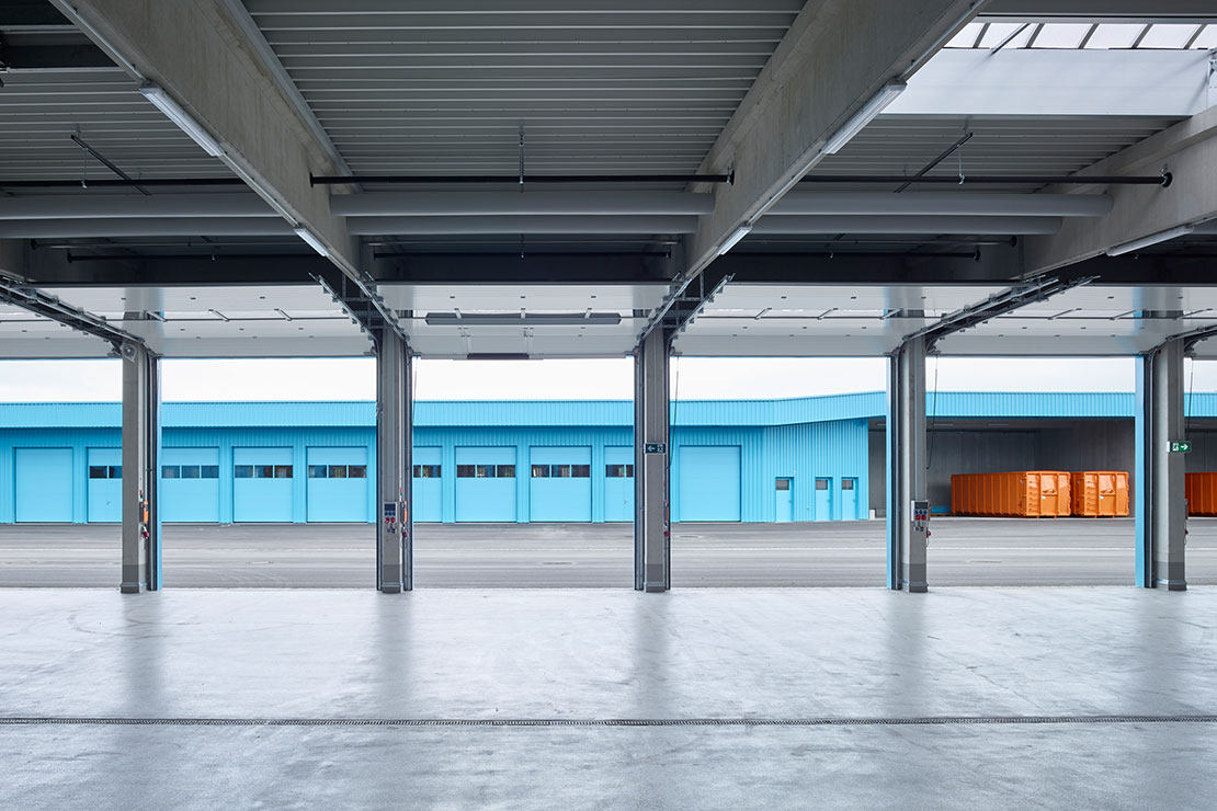
"One of the main challenges in designing the building was bringing the many different functional units 'under one roof' in a practical way, whether that was management, vehicle halls, the magazines, container storage, or the salt hall," explained the architect. The road maintenance depot is also located in a separate building on the premises – but closely connected to the recycling depot.
The sculptural and highly aesthetically pleasing shape of the building did not stem from a deliberately creative moment of inspiration, but instead purely from a question of function. The different elements were positioned in such a way that a spacious interior courtyard was the result, allowing vehicles and containers to move freely on the premises. Furthermore, each building has special requirements that had to be architecturally implemented and fulfilled.
"The parts of the building are just as high as they actually need to be – no higher, no lower. Then at the end, we connected everything with a straight line," says Knerer. The result of this pragmatic, functional assignment was a shape that is comparable to the aesthetics of an artwork. But it is not just this abstract shape that gives the recycling depot its character.
The color, in particular the strong Olympic blue, does just the same. It continually brings together and combines the different functions into one, serving as an overall signature for the architecture. Its power deliberately hides openings, doors and gates in places where they are beneficial to the users, but do not correspond to part of the current architectural aesthetic. Uneven proportions are drawn back and are hidden behind the blue wall.
We chose a color that represented the biggest contrast possible to orange.
Prof. Thomas Knerer
Color and identity
The team was particularly excited about the bold color selection in their new work environment. The photographic documentation that Knerer und Lang architects always carry out after completing their projects captures unique, personal, cheerful, colorful moments. This time, it was not just an architectural photographer that was on site; there was also a portrait photographer who captured the employees on their blue stage. They posed in everyday stances and the resulting photos can hardly be beaten in terms of their honesty, bringing their work as well as their personalities from darkness into light.
These photos show how the team already feel connected to the color – and that's how it should be. "We use color to assign identity," explains Thomas Knerer. In general, the impression is that the team love working together and know to value their work. They've created their own culture at work, doing yoga or cooking together. Thomas Knerer adds: "So we integrated a generous yoga space into the concept; this was already part of the culture at work here before the building was constructed. Our job was to create the right space for it."
But the most practical thing is only revealed in everyday life. Saturdays have a fixed routine at the site. This is when car after car arrives at the depot to deposit their bulky household waste. One goes left, the other to the right, when I can go, where do I need to go? So among other things, markings were applied after a period of time, which first of all needed to be tried and tested – so staff were even involved in designing the yard, which was of great benefit.
Color concepts
In general, the architects were very thorough, purposeful, and liked to work on paper instead of digitally – especially when it was about choosing the right material or color. The haptic feel, the effect in sunshine or in shadow as well as the interplay with other materials and colors are key criteria for making decisions, which can really only be fully played out when seen on site. "We very deliberately use colors or colored surfaces to form the design, because color shapes identity and allows room for interpretation," says Thomas Knerer.
The architectural firm enjoys working with contrasts and uses colors where it is already present, but also where it can offer the opportunity to function as a form of retreat and does not hem in or appear indifferent. The recycling depot in Augsburg is on the one hand, a bright Olympic blue, while on the other side it is wooden and offers unobtrusive interior spaces – a concept that combines the powerful colors with natural materials in a very special way. The architect claims blue is his favorite color shade – no matter the actual nuance, whether it’s powerful or soft, deep blue like the sea or radiant like the sky.
"When it comes to architecture, color choice is not a matter of personal choice, but instead it is absolutely about the place where the building is, its function and the materials that the color will eventually contrast with." In addition to the Olympic blue, yellow and purple were also among the color choices considered, but blue stood out due to its strong contrasting ratio to orange – and quite rightly so, because "opposites attract – in architecture, too."
The architects
Eva Maria Lang and Prof. Thomas Knerer founded the Knerer und Lang architectural firm in Dresden in 1993. Their projects surprise with sculptural presence, characteristic colorfulness, and disciplined details. They plan intuitively, focusing on design, creating from experience and a sense of personal intuition.
Photo: Christoph Reichelt
Photographers
Jens Weber and Orla Connolly tend to offer their services as a duo. He is an architectural photographer, while she specializes in portraits. After all, wherever architecture is made and then documented in photographs, there are also people, who work, live, benefit from, and use these spaces. And that's exactly how architecture should be. That's why they believe simply showing the pure architecture is not a true representation. While Jens Weber is mostly inspired by places, by the composition of light and mood, Orla Connolly speaks to the protagonists and allows them to tell their stories authentically, without staging – with no need for words.
Websites: www.jensweber.net / www.orlaconnolly.com