Scroll to top

Puschkinstraße, Oschersleben

Boldness and success of the shade coordination.

Board

Location Puschkinstraße 43, 39387 Oschersleben

Builder Andrea Hasselmann Oschersleben

Color concept Brillux color studio Braunschweig

Execution Malerbetrieb Hasselmann GmbH Oschersleben

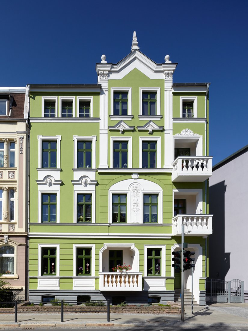
  • The beautiful, slightly colorful earth tone Veronese green is based on the old mineral pigmentation.

    The beautiful, slightly colorful earth tone Veronese green is based on the old mineral pigmentation.

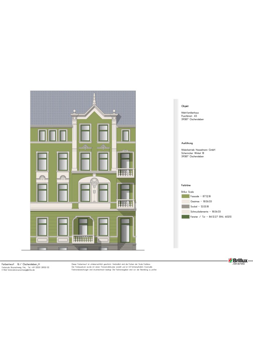
  • Color design from the Brillux color studio Braunschweig. Scala color shades used: 87.12.18, 18.06.03, 12.03.18, 84.12.27

    Color design from the Brillux color studio Braunschweig. Scala color shades used: 87.12.18, 18.06.03, 12.03.18, 84.12.27

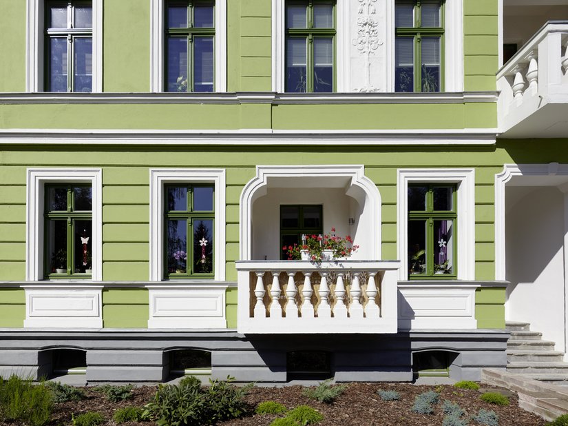
  • The gray base grounds the building well.

    The gray base grounds the building well.

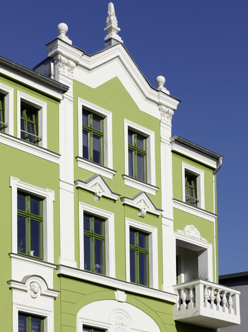
  • The white tone reaches to the crowning obelisks on the center gable.

    The white tone reaches to the crowning obelisks on the center gable.

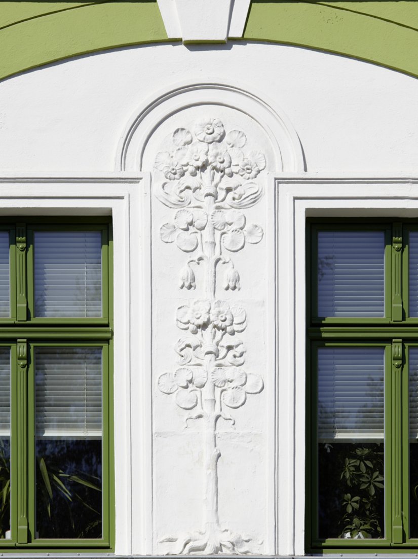
  • The window frames painted in bold green are a particular design highlight.

    The window frames painted in bold green are a particular design highlight.

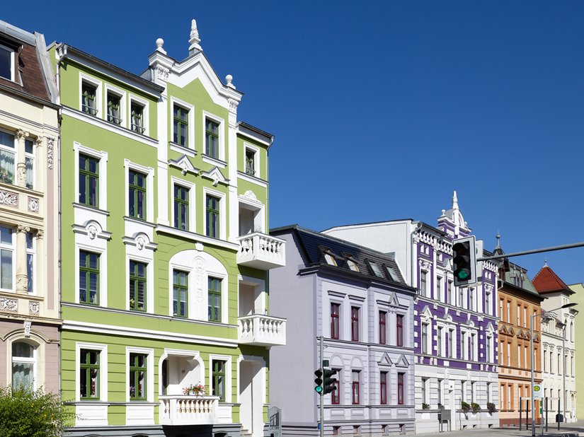
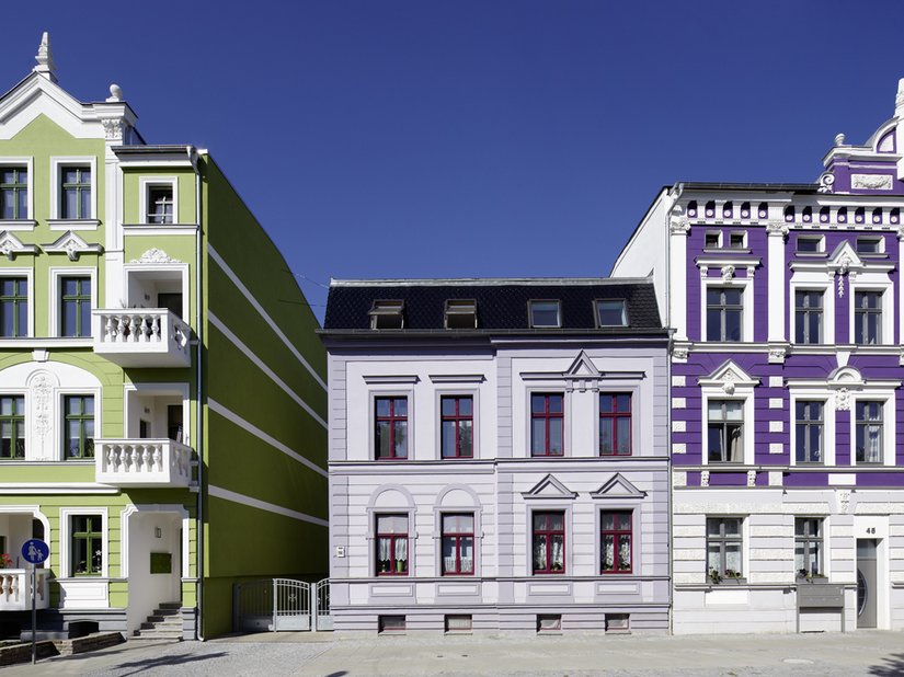
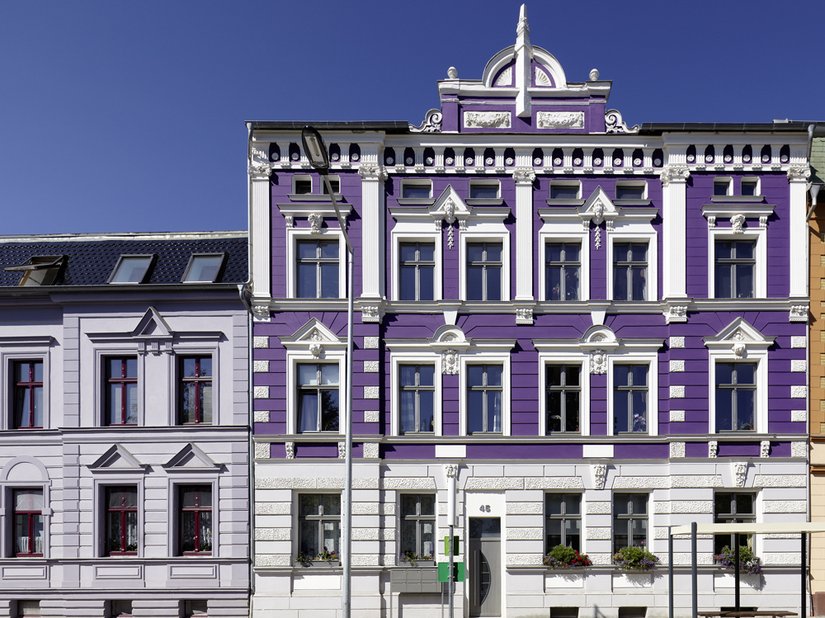
  • The facade also fits confidently in the varied color row in Puschkinstraße.

    The facade also fits confidently in the varied color row in Puschkinstraße.

  • The new facade color provides refreshing proof that renovations in a historic context don't always use white/gray.

    The new facade color provides refreshing proof that renovations in a historic context don't always use white/gray.

  • Brillux Acrylic Facade Paint was also used on the neighboring building.

    Brillux Acrylic Facade Paint was also used on the neighboring building.

This historic facade in Oschersleben, with a new color concept created in cooperation with the Brillux color studio in Braunschweig, provides refreshing proof that renovations in a historic context don't always use white-gray. The beautiful, slightly colorful earth tone Veronese green is based on the old mineral pigmentation, which, along with Paris Green, is familiar from many historic houses The clear white surfaces and frames contrast with a striking effect. The white tone reaches to the crowning obelisks on the center gable. The gray base grounds the building well. The window frames painted in bold green are a particular design highlight. The facade also fits confidently in the varied color row in Puschkinstraße.

Products used